Mastering Accessible Links: Everything You Need to Know


Links form the basis of the internet – they’re how we find the information we’re looking for, make purchases, and submit inquiries.
However, when links are set up incorrectly, they can prevent certain website users from having the experience you had in mind. This is where accessible links come in.
What Are Accessible Links?
An accessible link is linked text that clearly explains what will happen when a user clicks on it – no context necessary. It also means a user can clearly see when a link has focus or that text is linked at all.
Consider the fact that some users who rely on screen readers may just want to read a list of links on a page. If the linked text relies on the surrounding text to make sense, it won’t make sense to these users.
Then there are keyboard-only users who rely on tab buttons to navigate through a site’s links and buttons. If these users are unable to see when a link has focus, they cannot click on it.
Lastly, there are users with colorblindness. If they need to rely on color to identify links, it could create a frustrating experience for them.
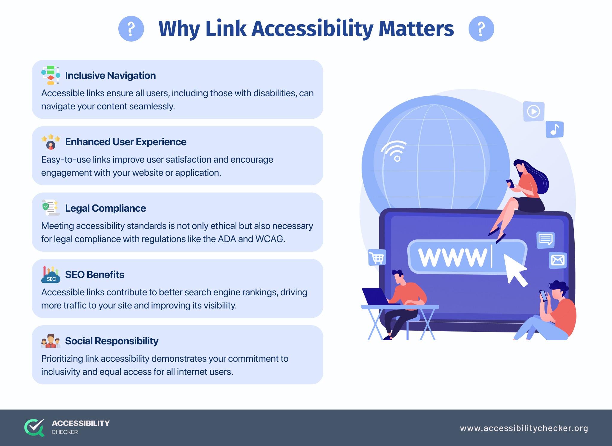
Why Link Accessibility Matters
There are several reasons why you need to make link accessibility a priority, including:
- Reaching more users. When the links on your site have been designed and labeled correctly, you have the opportunity to attract and keep more people on your site for longer.
- Providing a better user experience. Prioritizing link accessibility means you can better cater to people with disabilities and those who rely on assistive technology. A brand that values inclusivity is one with a more loyal customer base.
- Legal compliance. The Website Content Accessibility Guidelines (WCAG) form the basis of many global disability acts, including the ADA. Failure to comply leaves you open to accessibility lawsuits and no business is too big or small to be a target.
The Importance of ARIA Labels for Link Accessibility
Following the necessary visual guidelines for link accessibility is just as important as what needs to be done at a code level – enter ARIA labels.
Accessible Rich Internet Application (ARIA) labels are HTML attributes that add a clear, accessible name to elements on your website. This is what ensures assistive technology can provide users with the right information.
ARIA labels need to be housed within HTML tags. However, you should only add them to meaningful elements and link text or they could become overwhelming for users.
Here is an example of an ARIA label for an annual report that can be downloaded on a website:
Annual Report 2023: <a href=”URL” title=”Download PDF”>Annual Report 2023</a>
How to Make Your Links Accessible
Now that you understand the importance of ARIA labels, let’s look at a few other link accessibility guidelines you should follow.
Make Your Anchor Text Meaningful
When your anchor text is specific and meaningful, it makes your site that much easier to navigate.
Basically, you want to give users a good idea of where they will go or what will happen if they click on a particular link. However, don’t make your anchor text longer than 100 characters.
Your anchor text should ideally also make sense on its own and not rely on any surrounding text for context.
Some of the text you want to avoid includes, ‘click here’, ‘find out more’, and ‘click for details’.
Don’t Use URLs In Your Copy
It’s best to avoid adding full URLs to your website copy. This is because a screen reader will read every letter of a URL if it forms part of a body of text.
Shorter URLs generally won’t be an issue, but longer URLs within text can create a confusing experience for blind users or those with visual impairments. It’s always best to link text within your website copy.
Avoid Capitalizing Anchor Text
For users with learning, reading, and cognitive disabilities, anchor text that is made up of all capital letters can be very difficult to read.
It’s also possible that certain screen readers will interpret capital letters as the start of a new word, which means it will read your anchor text one letter at a time.
Don’t Use Tooltips Wherever Possible
While adding tooltips to your links can provide users with more context, they’re not always accessible to all users.
Some users who rely on screen readers tend to turn off titles to reduce the amount of auditory feedback they receive while on a site. What’s more, keyboard-only users won’t be able to access tooltips.
It’s always best to include an ARIA label alongside descriptive anchor text to provide users with the information they need.
Be Cautious with Color
It’s not uncommon for links to be a different color than the text surrounding them. However, using color to indicate a link is present could isolate certain website visitors.
It’s perfectly fine to use color to highlight a link, but this tactic needs to be used alongside other tactics such as ARIA labels. You can also choose to underline links, but it should be there constantly, not just on hover.
If you do choose to use color to showcase links, make sure that you’re adhering to a color contrast ratio of at least 4:5:1. You can use this free Color Contrast Checker tool to ensure you’re meeting the necessary requirements.
Create Custom Focus Styles
To assist keyboard-only users, you may want to consider creating custom keyboard focus styles.
Traditional browser focus styles are usually a thin dotted line or faint blue ring. However, these styles don’t always work well when it comes to certain types of links. Even more so if your site has a blue background.
Creating a custom focus style will ensure that keyboard-only users can have a better experience on your site.
Increase the Size of Your Links
For users with low coordination or those browsing on a mobile device, it helps to make your links large enough to click. However, ensure that larger links don’t take up too much screen space or users might activate them accidentally.
Another option is to simply add an additional style to your links. Many designers will include a background color or glow when a user hovers over or focuses on a link.
Combine Adjacent Links
Combining adjacent links will help create a better experience for users who rely on assistive technology.
For example, if a blog image and a “Keep Reading” button both link to the same URL, wrapping all elements within the same anchor tag will ensure assistive technology only reads it out once. It also means keyboard-only users will only see one focus link.
Conclusion
Even though links only take up a small portion of your website, they make a big difference to your user experience overall.
Taking the time to correctly design and set up URLs on your site will ensure you’re providing a more inclusive experience and comply with the necessary WCAG requirements.
FAQs
How do I make a list of links accessible?
Adding ARIA labels to your HTML code will ensure that assistive technology can clearly read a list of links back to a user. ARIA labels are HTML attributes that add accessible names to your links, making it clear what a link does or where it clicks through. However, even with these labels, it’s still important to make your anchor text clear and descriptive.