Expertly reviewed by
Ritvik Shrivastava

Accessibility Checker - Color Contrast for WCAG Compliance (Free)

When the background color of a website is too similar to the colors used for text and other UI elements, some visitors may find it difficult to read and understand your site. 

Find out whether your site meets WCAG color requirements using the below color contrast checker:

Result:25:1 - EXCELENT!
Large text example AA AAA
Small text example here, it's more important indicator AA AAA
Stop checking color contrast manually!

accessiBe's software will automatically notify you whenever your color contrast is not compliant:

Accessibility Checker

Scan your website for accessibility related issues for free

Why does color contrast matter to differently-abled people?

Website visitors with visual disabilities need to be able to distinguish between your content and the background of your site – this is where color contrast comes in.

Providing visitors with a more accessible online experience is the ethical thing to do. However, there is another key reason why you want to ensure that your site meets WCAG color contrast requirements.

In 2019, 2,256 digital accessibility lawsuits were filed in US federal courts – this is a 177% increase since 2017. 

Taking a proactive approach to check the color contrast on your site will protect you against demand letters, costly lawsuits, and a damaged reputation. 

A color contrast checker is a versatile tool that you can use to test web pages, infographics, slideshows, and more. It’s a must for any web designer or a business owner. 

By achieving the right color contrasts, you are providing every visitor with a better user experience, including those living with visual disabilities. 

Learn more about ADA Color Compliance for Your Website and ADA compliance.


How does it work?

A color contrast checker will test the colors on your site against the latest WCAG requirements. It will also provide you with recommendations on how you can offer users a more accessible online experience.

Color adjustments in the accessibility widget section

Website owners should aim to achieve compliance level AA as this means you meet the minimum contrast requirements. Level AAA indicates enhanced color contrast capabilities on a site.


How to interpret color contrast ratios?

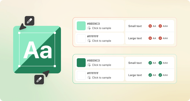
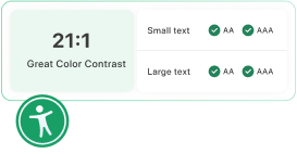
For normal text, which is less than 24 px or less than 18pt, WCAG level AA requires a color contrast ratio of at least 4:5:1. Level AAA requires a ratio that’s equal to or more than 7:1. 

For large text, which is equal to or more than 24 px or equal to or more than 18pt, WCAG level AA requires a color contrast ratio of at least 3:1. Level AAA requires a ratio that’s equal to or more than 4:5:1. 

Why does color contrast matter to differently-abled people?

Color accessibility refers to the color contrast ratios required to make it possible for all users to engage with a website or document, including visitors with visual impairments. Color contrast indicates how well someone can tell the difference between the background and the foreground of a website or PDF based on the colors used.

How to use the color contrast checker?

The AccessibilityChecker color contrast checker will help you determine whether people with visual impairments can engage with your website. 

The tool is designed to check your website against the latest Web Content Accessibility Guidelines (WCAG), which include color contrast ratio requirements. 

This color contrast checker uses the unique RGB values and HEX codes assigned to different colors to analyze and calculate contrast ratios, which are made up of two numbers. 1:1 is the weakest contrast, while 21:1 is the strongest. This would be like comparing white text on a white background to black text on a white background – the first would be impossible to read.  

To check whether your site meets the necessary WCAG requirements, you would need to type in the RGB or HEX values of the colors you want to compare. The tool will then calculate the color contrast ratio and tell you whether you conform to WCAG level AA or AAA.  

What are WCAG guidelines about color contrast?

WCAG outlines different color contrast requirements to achieve level AA vs level AAA. Conforming to level AA means that the color pairings on your site can be perceived by most users, but not all. Level AAA indicates the color pairings on your site can be perceived by almost all users. The color contrast ratio requirements for each level are as follows:

Level AA

  • Normal text: 4:5:1
  • Large text (18+ pts): 3:1

Level AAA

  • Normal text: 7:1
  • Large text (18+ pts): 4:5:1
Do images and videos have to comply with WCAG color contrast requirements?

Certain graphics and interface components require a contrast ratio of at least 3:1. However, this doesn’t include logos, decorative images, or general media files.