The Future of Contrast: Understanding the APCA Advanced Perceptual Contrast Algorithm
Color contrast has always been a numbers game. If your text hits the right ratio, you get a green checkmark and move on.
But many designers, developers, and accessibility specialists know that some color combinations that technically pass WCAG 2.x can still feel hard to read in the real world.
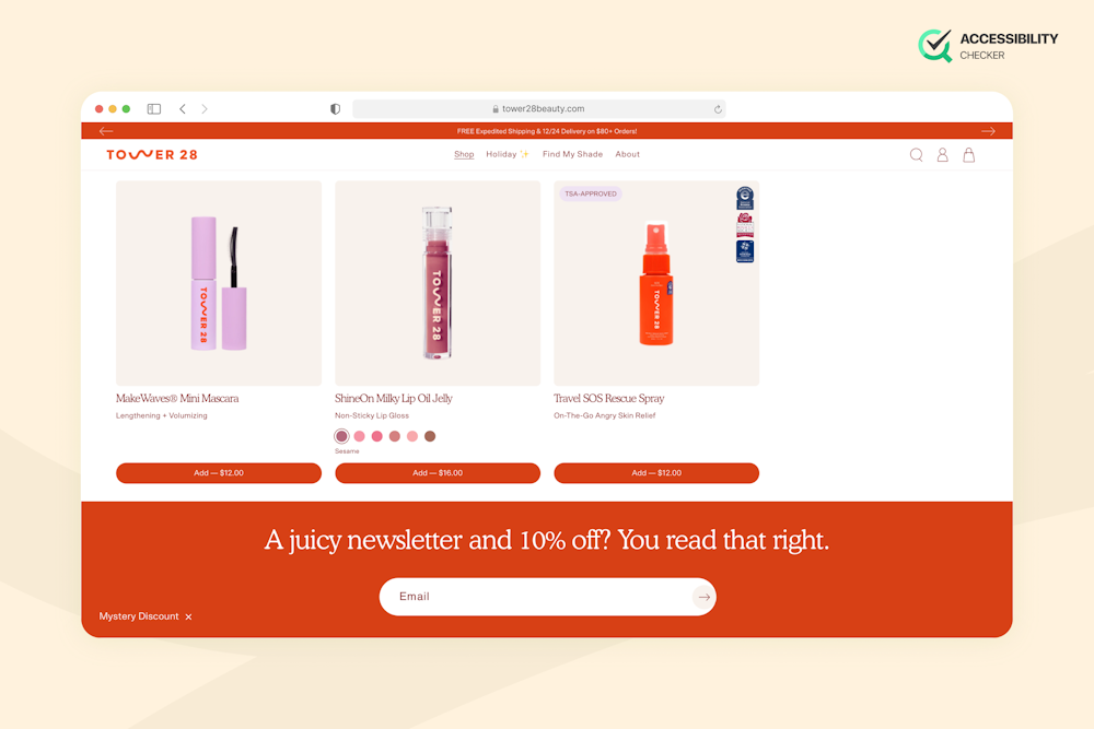
A common example is orange text on a white background. It’s compliant on paper, but can be visually fatiguing for many users, depending on the quality and brightness of their screens.
This gap between mathematical compliance and human perception is exactly what the APCA (Advanced Perceptual Contrast Algorithm) is designed to address.
It also supports the contrast model being explored for WCAG 3.0 (Project Silver), which will see a shift away from pass/fail ratios toward outcomes that better reflect usability and inclusion.
Let’s delve into this a little further, though.
The Problem with WCAG 2.x Contrast Ratios
WCAG 2.x contrast requirements are based on a simple luminance ratio.
Text and background colors are converted into relative luminance values, and the contrast ratio between them is calculated.
For normal body text, a ratio of 4.5:1 is required, and for large or bold text, the threshold drops to 3:1. If the numbers meet or exceed those values, the content is considered compliant.
This approach made accessibility easier to test and standardize, which was essential when WCAG 2.0 was first introduced. However, the problem is it treats contrast as a static property and assumes that readability remains consistent regardless of context, typography, or display conditions.
Why It Fails
In practice, the 4.5:1 model breaks down in several common design scenarios, and dark mode is a prime example.
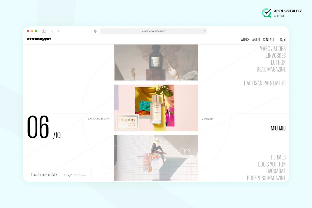
Bright text on very dark backgrounds often passes WCAG ratios but can cause halation and eye strain, especially when colors are highly saturated. Basically, the ratio formula has no way to account for this perceptual effect.

High luminance presents another issue. Colors like bright orange, red, or green can mathematically contrast well against white, but they can also appear thin, vibrating, or difficult to focus on. This is why combinations such as orange on white often feel uncomfortable to read despite being “accessible” by WCAG 2.x standards.

Finally, WCAG 2.x largely ignores font weight and typographic nuance. A light-weight font and a bold font are treated the same if the color values match, even though their readability is dramatically different. Thin strokes need more perceived contrast to remain legible, especially at smaller sizes.

By overlooking these factors, contrast ratios end up optimizing for compliance rather than actual human readability, a gap APCA is specifically designed to close.
How APCA Works: A Paradigm Shift
APCA represents a fundamental shift away from treating contrast as a purely mathematical color comparison.
Instead of asking “Do these two colors meet a fixed ratio?”, APCA asks “How readable is this text for a human viewer?”
Traditional WCAG 2.x contrast relies on static luminance ratios that assume the eye responds linearly to light, but human vision doesn’t work that way.
We perceive contrast differently depending on polarity, surrounding brightness, color saturation, and typographic detail. APCA is built around these perceptual models of vision, meaning its scores are designed to reflect actual readability on screens, not just numerical compliance.
Understanding Lc (Lightness Contrast) Values
Instead of a single pass/fail ratio like 4.5:1, APCA uses Lc (Lightness Contrast) values, which represent the perceived contrast strength between text and background.
Rather than drawing a hard line, APCA works on a sliding scale:
- Lc ~60: Suitable for large or bold text, such as headings or prominent UI labels.
- Lc ~75: Appropriate for standard body text in many interface contexts.
- Lc ~90: Recommended for smaller text, thinner fonts, or important reading scenarios.
This approach acknowledges that not all text serves the same purpose.
A navigation label, a paragraph of body copy, and a legal disclaimer don’t need to be treated in the same way. Instead, APCA allows designers and developers to choose contrast targets based on reading effort and importance, not the usual thresholds.
The Role of Font Weight and Size
One of APCA’s most important improvements is that it explicitly accounts for font weight and size.
Thin, light-weight fonts have less visual “ink” on the screen, making them harder to perceive, especially at small sizes. These fonts require higher Lc values to remain readable.
Conversely, heavier or bolder fonts can tolerate lower contrast while still being legible, because their thicker strokes provide stronger visual signals. WCAG 2.x largely ignores this distinction and treats all text equally once a size breakpoint is crossed.
By incorporating typography into the contrast equation, APCA aligns contrast guidance with how designers actually build interfaces and how users actually read them.
The result is contrast guidance that supports better design decisions, and not just better scores in a checker.

APCA vs. WCAG 2.1: A Direct Comparison
One of the clearest ways to understand why APCA exists is to look at how it evaluates the same color combinations differently from WCAG 2.1.
Where WCAG relies on fixed ratios, APCA evaluates contrast in context, which means polarity, luminance, and typography are factored in.
| Scenario | WCAG 2.1 (Contrast Ratio) | APCA (Lc Values) | What Users Actually Experience |
| White text on medium blue button (bold label) | Pass (≥ 4.5:1) | Pass (Lc ~60–65) | Clear, readable, low effort |
| White text on light blue button (regular weight) | Fail (< 4.5:1) | Conditional pass (Lc depends on weight/size) | Often readable at larger sizes |
| Bright orange text on white background | Pass | Borderline / Fail | Visually fatiguing, thin strokes |
| Light grey text on black (dark mode) | Pass | Fail (low Lc) | Hard to read, causes strain |
| Dark grey text on white background | Fail | Pass (sufficient Lc) | Comfortable and readable |
False Passes and Fails In the Old System
Under WCAG 2.1, a false pass occurs when a color combination technically meets the contrast ratio but performs poorly for real users. Dark mode interfaces are a common source of these issues.
A false fail, on the other hand, happens when readable combinations are flagged as non-compliant. White text on a strong blue button is a classic example.
In practice, these labels are often bold, large, and brief, making them easy to read. WCAG may fail them numerically, but APCA recognizes that the perceived contrast is sufficient for the task.
By reducing both false passes and false fails, APCA shifts the focus away from chasing ratios and toward evaluating reading comfort, intent, and usability.
Practical Application: Using APCA in Design
APCA is most powerful when it’s used early and consistently, not as a last-minute compliance check.
Recommended Tools and Calculators
Because APCA is still in its early phases, not every contrast checker supports it correctly, so it’s important to rely on tools that implement the official APCA model rather than approximations.
Here are some reliable options:
- APCA Contrast Calculator (Myndex). This is the reference implementation created by the author of APCA. It allows you to test color pairs while adjusting font size and weight to see how readability changes in context.
- APCA-Enabled Design Plugins. Some Figma and design-system plugins now support APCA-based contrast checks, helping designers validate contrast while working in mockups.
- Browser-Based Accessibility Tools. A few of the latest accessibility tools like Polypane, have begun offering APCA readouts alongside WCAG ratios, which can be useful for comparison and education.
When using these APCA tools, pay close attention to polarity, font weight, and intended text size, as these inputs directly affect the resulting Lc value.
Best Practices for Dark Mode vs. Light Mode
APCA highlights that dark mode and light mode should not be treated as simple inversions of each other.
In light mode, darker text on lighter backgrounds tends to be more forgiving. You can often use softer dark greys instead of pure black while still achieving strong Lc values and comfortable reading.
In dark mode, restraint is key. Avoid highly saturated or extremely bright text on near-black backgrounds, even if it “passes” legacy ratios. Softer off-white text, reduced saturation, and slightly elevated background tones are what help prevent halation and eye strain.
APCA scores will typically reflect these improvements by producing higher, more stable Lc values for the same content.
Your goal should be optimal contrast for sustained readability and not maximum contrast.
How to Audit Your Current Colour Palette
Auditing with APCA starts by looking at your interface as users experience it.
Start by identifying all text-related elements in your design system. This would include body text, headings, buttons, labels, form hints, and error messages. Next, test each combination using an APCA calculator and note the Lc values alongside font size and weight.
You can now group results by purpose. Essential reading text should have higher Lc values, while short, bold UI labels can safely use lower ones. You’ll also want to pay special attention to dark mode variants, where legacy contrast checks often hide problems.
Finally, document your findings into contrast guidance within your design system. This turns APCA from a theoretical concept into a practical, repeatable part of your design and accessibility workflow.
Conclusion
APCA is definitely a meaningful step forward in how we think about color contrast and readability.
By modelling human visual perception rather than relying solely on static ratios, it helps reduce false passes, avoid false fails, and supports more thoughtful decisions around typography, dark mode, and colour use.
That said, WCAG 2.1 still matters. It remains the legal and regulatory standard in many regions, and it should continue to be used for formal compliance and reporting because APCA is not a replacement yet.
The best path forward is balance. Continue meeting WCAG 2.1 requirements to stay compliant, but start applying APCA during design and development to improve real-world usability. Teams that adopt APCA now will be better prepared for WCAG 3.0, and more importantly, they’ll be designing experiences that work better for actual people.


