Email Accessibility: A Guide to Inclusive Communication


As time has passed and the digital world has changed, email is one of the few things that has stayed consistent.
Countless people still use email every day. We turn to our inboxes for work emails, to communicate with the people in our lives, and to connect with brands.
The fact that email still plays such an integral role in our lives is the reason why email accessibility matters.
What Is Email Accessibility?
Email accessibility means ensuring all recipients are able to receive and understand your emails, regardless of whether they have a disability or rely on assistive technology.
The goal is to provide all of your customers with a positive experience with your brand. A commitment to inclusivity automatically boosts brand loyalty.
Failing to consider email accessibility means you will end up isolating countless subscribers. The fact that over one billion people (1) across the globe are currently living with some form of disability should give you an idea of how many potential customers you might be losing.
And, as you might imagine, when a user cannot open or engage with your email, it will negatively impact your email performance stats. Not to mention the fact that you’re giving your competitors a chance to get ahead.
The Implications of Not Prioritizing Email Accessibility
Over and above email accessibility being the right thing to do, there are also legal implications to be aware of.
Acts such as the ADA and the AODA in Canada take accessibility seriously. Failure to comply with web accessibility standards can result in costly penalties and lawsuits.
In 2022, web accessibility lawsuits (2) increased by 12%. This is because law firms are now very familiar with the Web Content Accessibility Guidelines (WCAG) and are always on the lookout for non-compliant businesses.
Real Examples of Accessibility in Email Marketing (Dos & Don’ts)
Let’s take a look at a few examples of real emails and what they got right (and wrong) in terms of email accessibility.
SHEIN
This is a fashion brand, so understandably, their emails will be more visual. Unfortunately, not only is the typeface difficult to read because of how tightly packed the letters are, but the images don’t have any alt tags. This would make it almost impossible for someone with a screen reader to understand what’s in this mailer.

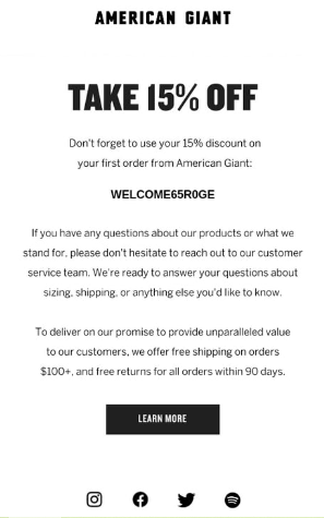
American Giant
To cater to all users, American Giant opted for high-contrast colors, a simple layout, and they didn’t use any images. All of the email’s most important information is in a text format, making it accessible to everyone, including those who rely on assistive technology. The typeface and line spacing also make the copy easy to read.
The IV Bar
Their emails certainly look good, but it falls short in terms of accessibility. The small, white text on the light blue background would fail a color contrast test. What’s more, some of the lettering has serifs, which are slight projections – these are not deemed accessibility-friendly. Lastly, the main image of the email doesn’t have an alt tag.

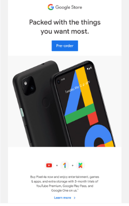
Google Store
This is an excellent example of an accessible email and naturally, it’s a mailer from Google. The formatting is great as they’ve used columns to accommodate all the copy and visuals. This ensures screen readers can relay all the information in a logical way. There are also enough gaps in between content sections, headings are clear, images have alt tags, and they’ve used a neutral typeface.
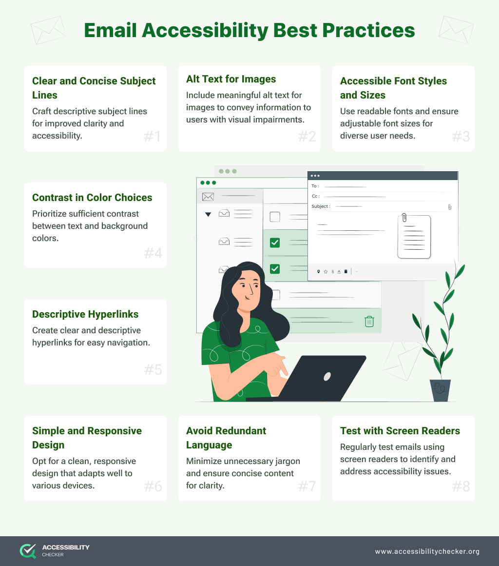
Email Accessibility Best Practices
Now that you have a better idea of what an accessible email should look like, here are some best practices to follow to ensure you can achieve the same result.
Email Design
Think twice about color. Make a point of using a high color contrast between different elements, backgrounds and copy specifically. The recommended color contrast is 4:5:1. And because some subscribers will be color blind, it’s important to not only use color to convey information.
Choose your typeface carefully. Choosing fonts for your emails can be fun. It’s a great way to showcase your brand’s personality. Unfortunately, not all fonts are accessibility-friendly. Select a font that is evenly spaced and not too condensed – this blog will help.
Opt for larger fonts. Any font that is smaller than 14px will be difficult to read without using the zoom function, even on a desktop. It’s best to eliminate this extra step by setting your fonts to at least 16px using media queries. This will ensure that even users on mobile devices can read your text.
Larger buttons are better. Anything that a user would need to click on should be big enough to easily tap with a finger. This is especially true for subscribers with motor impairments. Ensure that non-text and informative UI components, such as cross (X) for closing or dismissing content, graph components, outlines for buttons, etc. also comply with color contrast requirement and have a ratio of 3:1 with their adjacent colors.
Email Layout
Let your copy breathe. Consider whether your sentences might be spaced too closely together, making them more difficult to read. An ideal line height for emails is 1.5x or 2x your font size. You also want to keep your paragraphs short and scannable.
Don’t justify your copy. Justifying your email copy means the text will be flush with both the right and left margins, which can make your copy difficult to read.
Include semantic elements. For subscribers who rely on screen readers, semantic elements such as <p> and <h> really help. Ensuring correct hierarchical heading labels, such as <h1>, <h2>, etc., also plays a crucial role in defining the layout of email content efficiently. They make it possible for a reader to scan your email according to headers and sections. Semantic elements also make it easier to adjust the font size and line height for different lines of copy.
Add alt tags. Just like your website graphics, alternative text needs to be added to your email graphics too. It may even be more important because many email clients automatically block images. With alt tags, a disabled user will still be able to “see” your images with the help of assistive technology. Just make sure that your alt tags are linked to the content around it or a user won’t have context. Additionally, ensure that the decorative images have a null alt text so that to facilitate convenience for assistive technology users.
Use role=”presentation” for all presentational tables. Designers often need to use tables to hold content due to email client restrictions. To help readers differentiate between decorative tables and those that house content, add role=”presentation” to the <table> tag of any tables that contain content.
Use aria-hidden=”true” for irrelevant elements. Any visual content that screen readers don’t need to pay attention to should have the aria-hidden=”true” HTML tag.
Email Content
Avoid flashing and animated content. Flashing and animated content will negatively affect photo-sensitive users. It’s best to avoid this type of media in emails altogether.
Balance text and images. Images shouldn’t be used to convey meaning alone as this may leave some subscribers in the dark. Your email content should always be used to deliver your most important messages.
Simplify your copy. Nobody generally wants to read through lengthy complicated copy. This is even more true for readers with cognitive and intellectual impairments. Write your copy in plain, simple language wherever possible and avoid jargon. Hemingway is a great tool for determining how difficult your copy is to read.
Give links context. “Click here” is no longer the best copy to link as it doesn’t provide disabled users with enough context. Keep your anchor text more descriptive to give disabled subscribers a chance to decide whether they would like to click on a link or not. Also, avoid using same anchor text for more than one links.
How to Test for Email Accessibility
Once you’ve designed your email campaign, here are a few things to keep in mind as you test for email accessibility:
Disability types. When testing your email campaigns, you need to keep the different types of disabilities in mind. Hearing, visual, cognitive, and mobility impairments should all be considered.
Assistive technology. Some subscribers will rely on assistive technology to open and engage with your emails, so it helps to test your campaigns accordingly.
Different devices. Test for email accessibility across different devices to ensure your email is not only responsive, but compatible with mobile assistive technology too.
Images. If you need to include a fair amount of images in your email, view it without the images to ensure it’s still understandable without visual context.
Color contrast. Use a color contrast tool to make sure that your color combinations won’t isolate visually impaired users, including those with color blindness. AccessibilityChecker has a free Color Contrast tool.
Headers. Read just the subject line and headers of your email to decide whether it flows and would make sense to someone using a screen reader to scan your mailer.
Accessible Emails for All
If email marketing is a primary part of your marketing strategy, accessibility needs to be a key consideration.
Not only are you adhering to legal web accessibility requirements, but you’re also ensuring that your brand provides a more inclusive experience to all users. The result is greater brand loyalty and hopefully, more sales too.
FAQs
What is accessibility mode on email?
Some email clients such as Outlook have accessibility checkers that automatically run in the background when you compose an email. If an accessibility issue is detected, you will be notified, allowing you to correct the problem before you hit send. It’s highly recommended that you use accessibility mode when sending professional emails.
What are the benefits of email accessibility?
Email accessibility is not only a legal requirement, but it prevents you from isolating disabled subscribers who rely on assistive technology to engage with your brand. Brands that promote inclusivity are also known to have a larger, more loyal customer base.