Web Accessibility Best Practices
Congratulations! Your website is now accessible. But, your accessibility journey doesn’t end here.
Accessibility is an ongoing process. Whenever you make adjustments to your site, it’s important to follow some essential best practices to ensure you can retain your compliant status.
This way, each of your operating team members has a specific section they can focus on, ensuring you can continue providing an inclusive experience to all of your website users and visitors.
However, it’s essential to note that many of the best practices overlap between the different content, design, and development teams. Therefore, it’s crucial for all team members to have a comprehensive understanding of these shared best practices to ensure a unified and effective approach in providing an inclusive experience to all website users and visitors.
Best Practices for Content Updates
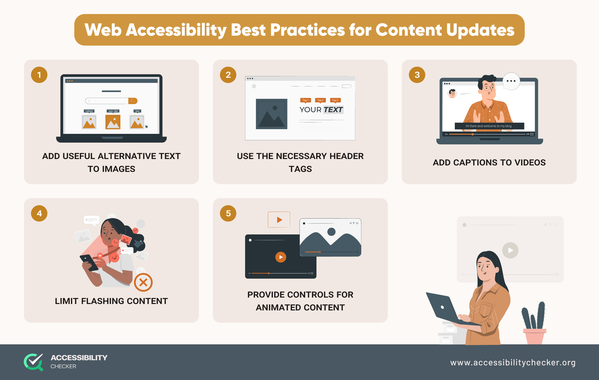
When updating your content or adding new content to your site, here are some best practices to abide by.

Add Useful Alternative Text to Images
Users with visual impairments rely on alternative text to understand images on a page. Make sure that you are always adding useful alternative text to the <alt> attribute whenever uploading an image that’s relevant to your content.
The text should be clear, relevant, and shouldn’t be too long or it could create a frustrating and confusing experience. Alternative text isn’t necessary for decorative images. For these images, you can leave the <alt> attribute empty.
Use the Necessary Headers Tags
Header tags such as H1, H2, and H3 not only make it easier to read your content but will emphasize the importance of certain information and outline the hierarchy of a page’s content.
For this reason, it’s also essential to use headers in the right order. An H2 header should always follow an H1 header and H3 headers should always follow H2s.
Add Captions to Your Videos
If you regularly create and post video content, captions will ensure users with hearing impairments can still engage with your content.
Platforms such as YouTube will automatically generate captions, but you should still check them for accuracy. If you also create and post podcasts, a transcript should be provided.
Limit Flashing Content
Flashing or blinking content should be avoided wherever possible as it can trigger seizures in certain site visitors.
If you cannot avoid animated content, make sure that it doesn’t flash more than three times in any one second. It also helps to provide users with a warning about any flashing content.
Provide Controls for Animated Content
Carousels and sliders should always have next and previous controls. Users should also have the ability to pause or stop the content.
For sliders and carousels with text, ensure that a screen reader will be able to read the text out loud. It should also be able to read the number of the slide that a user is currently on. You can do this using HTML aria-attributes.
Lastly, make sure users can operate carousels and sliders with a keyboard alone.
Best Practices for Design Updates
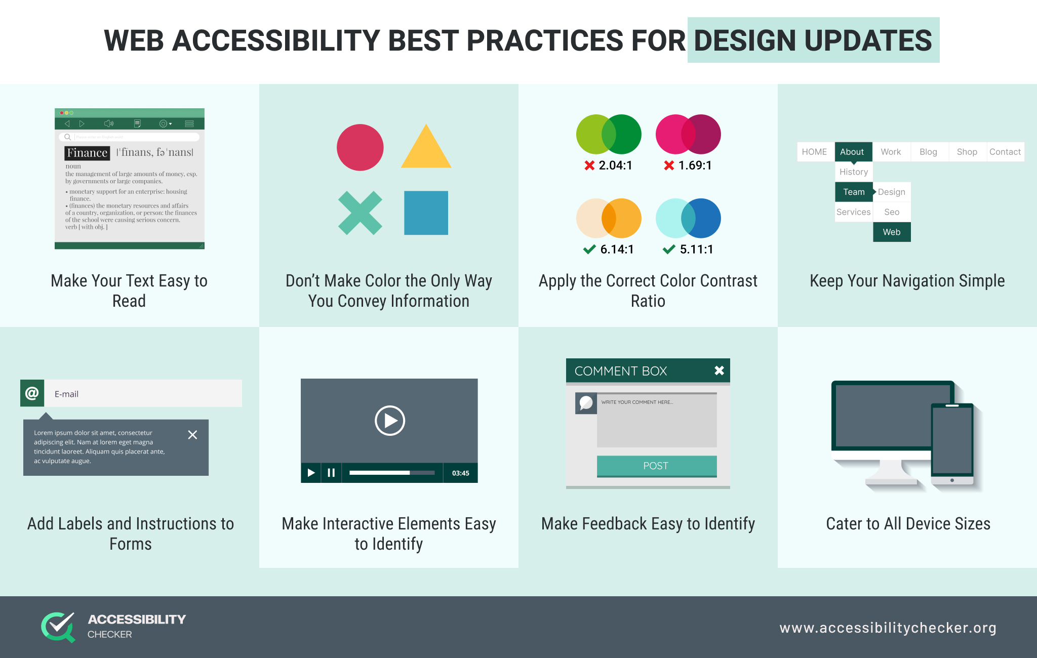
If you’re planning to change the look and feel of your website, here are some best practices to keep in mind.

Make Your Text Easy to Read
For any body copy, a font size of at least 16px and no less than 13px is recommended to aid with readability. It’s also best to avoid all CAPS, which can be difficult for some people to read.
It’s also important to choose an accessible font. Tahoma, Calibri, Helvetica, Arial, Verdana, and Times New Roman are all good options.
The line height of your text is also important – make sure that it’s not too wide or narrow.
Lastly, make sure your site supports text resizing.
Don’t Make Color the Only Way You Convey Information
Every color carries a different meaning, but this won’t mean much to someone who is color blind. Never rely on color alone to convey meaning.
For example, using a red icon to indicate an error won’t have meaning to someone with color blindness. You should add a text error message too. It’s also best to stay away from using color text where possible, especially when placed on a low-contrast background.
Apply the Correct Color Contrast Ratio
Using the wrong color contrast will make it impossible for some users to distinguish between text and the background of your site.
The ideal contrast ratio between your text and its background needs to be at least 4.5 to 1 for normal text and 3:1 for larger text.
The only exceptions to this are:
- If your font is at least 24px, the minimum color contrast ratio requirement is 3:1.
- Text or images of text within an inactive UI component don’t have color contrast requirements.
- Text within a logo or brand name doesn’t have color contrast requirements.
You can use our free Color Contrast Checker tool to test your site.
Keep Your Navigation Simple
Your navigation should always be clear, easy to use, and available on all pages. Drop-down menus can help simplify your navigation and are accessible using a mouse, keyboard, and screen reader.
It also helps to apply focused states, which will indicate where a user is on your site at all times. This caters to people browsing your site on any device and those who rely on keyboards for navigation.
Add Labels and Instructions to Forms
Users with cognitive disabilities and those who rely on screen readers can have trouble using forms that do not have labels and visual cues. Make your forms easy to understand by making it clear what each form field is for.
It’s also important to make your form fields large enough and your buttons easy to click, which will aid users with mobility impairments.
Make Interactive Elements Easy to Identify
Elements such as links and buttons should have distinct styles so that they’re easy to identify. For example, when a user hovers over a link using a mouse or keyboard focus, it should change color.
Make Feedback Easy to Identify
Any time an error occurs on your site, a user should know that one has occurred. They should also know what steps to take to clear the error. Make sure you are presenting your feedback in a unique style to make it easier to spot.
Cater to All Device Sizes
Building responsive websites has always been important, but even more so if you want to be compliant with accessibility guidelines. Regularly test your site on different browsers and devices. Ensure that all of the elements on your site are completely visible on the screen and that you’re making the best use of the screen space.
Best Practices for Code Updates
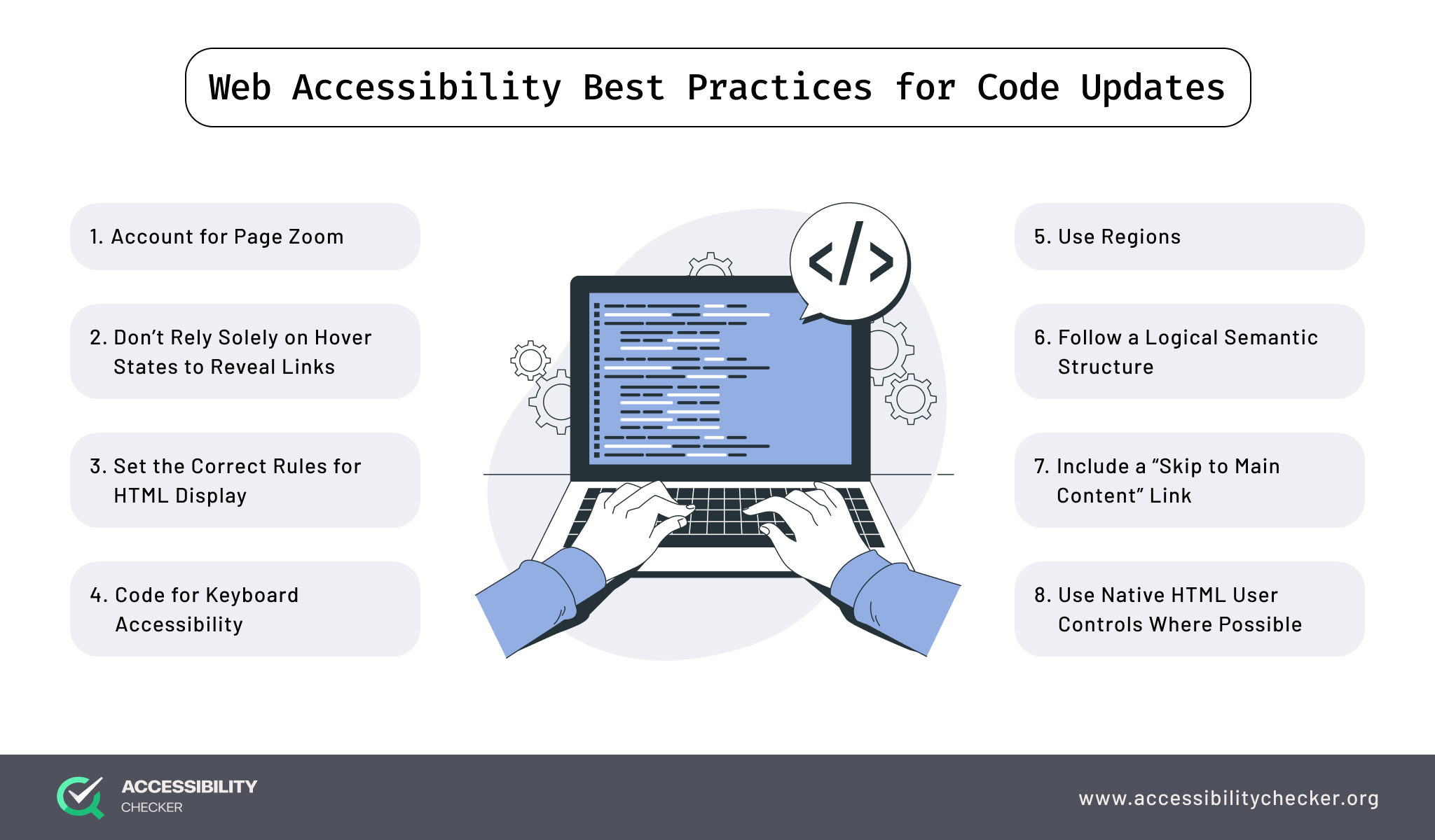
There will be times when you need to update the code of your site to achieve certain functionality – here are a few best practices to keep in mind.

Account for Page Zoom
A site visitor should be able to zoom in by up to 400% without your content losing meaning or functionality. Making your site responsive will ensure that you’re accounting for page zoom.
Don’t Rely Solely on Hover States to Reveal Links
Hover states are one of the easiest ways to highlight a link, but this won’t always work for users with disabilities. Not all users can use a mouse to navigate your site.
This doesn’t mean you need to replace hover states completely though. Instead, place secondary actions inside of menus and let them darken for contrast when hovered or tabbed on.
Set the Correct Rules for HTML Display
HTML content that is set to “display:none” will be ignored by assistive technologies. However, setting HTML content as “opacity:o” or “visibility:hidden” can be reached. Make sure you are applying the correct rules for HTML display to avoid a confusing experience for users.
Code for Keyboard Accessibility
Your site’s code should make it possible for users to navigate your site using just a keyboard. Test your website by navigating your site using the TAB key. The keyboard focus should not disappear or jump out of order.
You also need to make sure any clickable elements can be activated using the ENTER key. For sub or drop-down menus, the TAB and up and down arrows should work.
Checkboxes and radio buttons should be selectable with the SPACEBAR.
Follow a Logical Semantic Structure
The quality of your HTML semantics will also contribute to your site’s accessibility. It will determine how assistive technologies make sense of your content. If a screen reader is unable to read content correctly, it’s an indicator that the incorrect HTML markup is being used.
Use Regions
Marking up different regions on the pages of your site using the appropriate elements will ensure they can be identified by web browsers and assistive technologies.
HTML5 markup is recommended for this as it includes elements such as <header>, <nav>, <footer>, and <section>.
Include a “Skip to Main Content” Link
Give assistive technology the option to bypass your primary navigation and site header by including an invisible “skip to main content” link.
The link will be visible to the naked eye but can receive keyboard focus. This provides disabled users with the option to focus on the main content on any given page.
Use Native HTML User Controls Where Possible
Implementing native HTML user controls will cover a lot of bases to keep your website accessible. For example, checkboxes would have a <input type=”checkbox”> tag and buttons would have a <button> tag.
Keeping Your Website Accessible and Compliant
Along with following these best practices, it’s highly recommended that you test your site intermittently against the latest WCAG guidelines. This will ensure you can avoid costly lawsuits and unnecessary brand damage.
Contact us to claim your 50% discount when you’re ready to re-audit your website.
Accessibility Checker
Scan your website for accessibility related issues for free


