How to Ensure ADA Color Compliance For Your Website


Colors play an integral role in our lives, which is why it’s so important for a brand to choose its colors carefully.
Businesses and brands use colors for recognition and to stand out from competitors. Hence, using colors is a helpful way to establish a unique brand identity.
The thing is, colors aren’t only crucial when building a brand. They’re also important in terms of accessibility.
Too many branding agencies fail to check colors against current Web Content Accessibility Guidelines (WCAG) and ADA guidelines. Luckily, we’re here to help you out.
Today’s article will cover what an accessible color palette is and why it matters.
Understanding Website ADA compliance

When it comes to website ADA compliance, a few factors need consideration. To make the digital landscape accessible, individuals and organizations need to ensure that their websites adhere to compliance standards.
Additionally, the applicable accessibility standards vary depending on where you are in the world. However, most brands use the Web Content Accessibility Guidelines (WCAG) as a reference for ADA compliance.
Various components come into play when making a website accessible. Generally, these include text, images, and of course, color.
If these website elements are not given enough attention, you could create a challenging experience for visually impaired users.
The key is to ensure that your website’s colors have a certain contrast level. This way, the widest possible audience can understand and engage with your website.
What Is Website Color Contrast and What’s Its Role in Website Accessibility?
In the digital landscape, color contrast is associated with the color’s hue, tint, or saturation. But in simpler terms, color contrast ensures that the background and foreground colors have enough visual difference between them.
Typically, color contrast is expressed as a ratio. The higher the number, the greater the contrast between the two colors.
For example, white and black have a contrast ratio of 21:1. On the other hand, white and yellow have a color contrast ratio of 1.07:1.
When these two colors are overlaid, having a higher color contrast ratio is more beneficial. As you might know, reading white text on a black background is easier than reading white text on a yellow background.
While some color contrast issues can be spotted quite easily, others are difficult to identify with the naked eye. Your color choices impact the overall user experience. So if your website has bad color contrast, your site can be unusable for many users.
Don’t know where to start? The WCAG provides several guidelines related to proper contrast ratios.
According to the WCAG 2.2, there are three success criteria addressing contrast.
- Success Criterion 1.4.3 Contrast (Minimum): This criterion adheres to level AA of the WCAG 2.2 and requires a ratio of at least 4.5:1. It includes the visual presentation of text and images of text.
- Success Criterion 1.4.6 Contrast (Enhanced): This criterion adheres to level AAA of the WCAG 2.2 and requires a ratio of at least 7:1. It includes the visual presentation of text and images of text.
- Success Criterion 1.4.11 Non-text Contrast: This criterion adheres to level AA of the WCAG 2.2 and requires a ratio of at least 3:1. It only includes user interface elements and graphical objects.
How Does Color Contrast Affect People With Disabilities?
As we’ve mentioned, color contrast plays a huge role in your website’s usability. If your site has insufficient color contrast, it can make it difficult for users with visual impairments to access your content.
For example, most types of visual impairment, like myopia, make it difficult for users to read text when there is low contrast.
Low color contrast can also cause issues for color-blind users, even when there aren’t any other problems with their eyesight.
Aside from users with disabilities, color contrast can affect the aging population.
As we grow older, our eyesight also changes. Visual acuity (1) declines when we’re entering our 70s, even for those whose eyes have been healthy.
A common problem for the aging population is low contrast sensitivity. Hence, when your website doesn’t have an accessible color contrast, a potentially large percentage of your customers can’t access your content.
Contrast Tools to Use for ADA Color Compliance
One way to avoid color contrast issues is to use online contrast tools. These tools ensure that your website’s colors have the appropriate contrast, consequently making your website accessible to a wider user base.
If you’re unsure of whether your site meets the necessary color contrast requirements, we recommend using the tools below.
1. AccessibilityChecker Color Contrast Checker
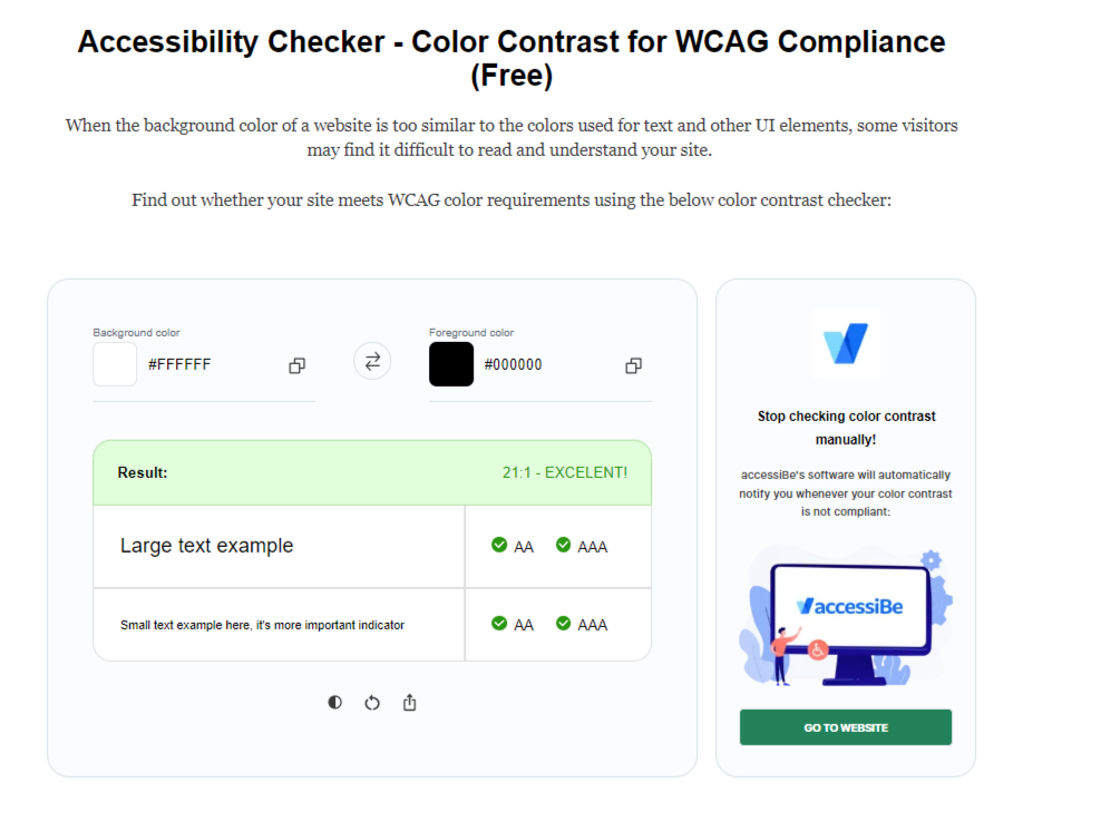
AccessibilityChecker’s Color Contrast Checker is incredibly simple to use.
The tool uses unique RGB values and HEX codes to carefully analyze and calculate color contrast ratios. 1:1 is the weakest contrast and 21:1 is the strongest – 1:1 would be like trying to read white text on an equally white background.
All that’s required is for you to type in the RGB or HEX values you want to compare and the tool will do the rest.
This color contrast checker conforms to WCAG level AA or AAA, ensuring your site or mobile application meets the necessary standards.
2. Colorable
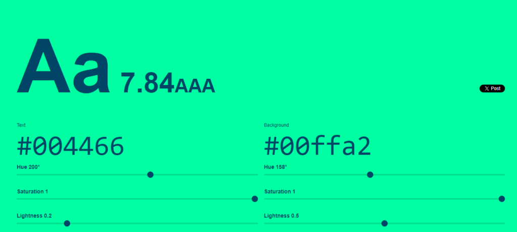
Colorable is a helpful contrast tool that can help you visualize your colors – you can only test two colors at once.
However, you can use this tool to change the color’s hue, saturation, and lightness. This way, you can find the right colors for your site.
3. Monsido Contrast Checker
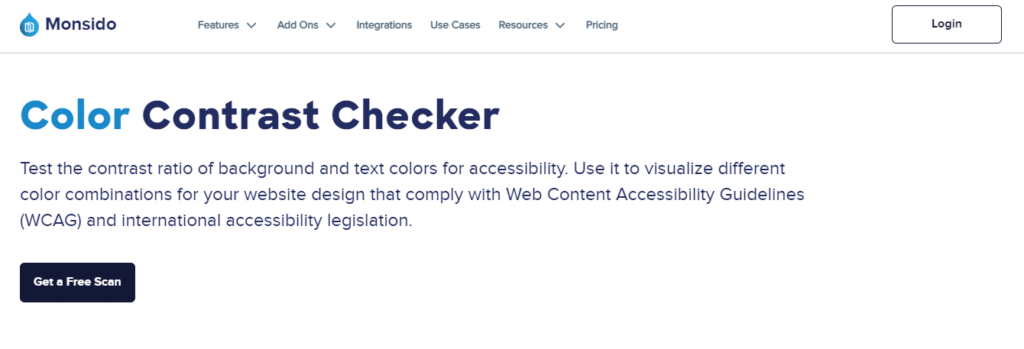
Another great tool to check for color contrast is the Monsido contrast checker. Like other tools on the list, this contrast tool allows you to test two colors at once.
This tool’s good because it determines what WCAG conformance levels the colors adhere to. It’s also a good way to visualize different color combinations on your website.
4. Git Hub’s Accessible Palette Builder
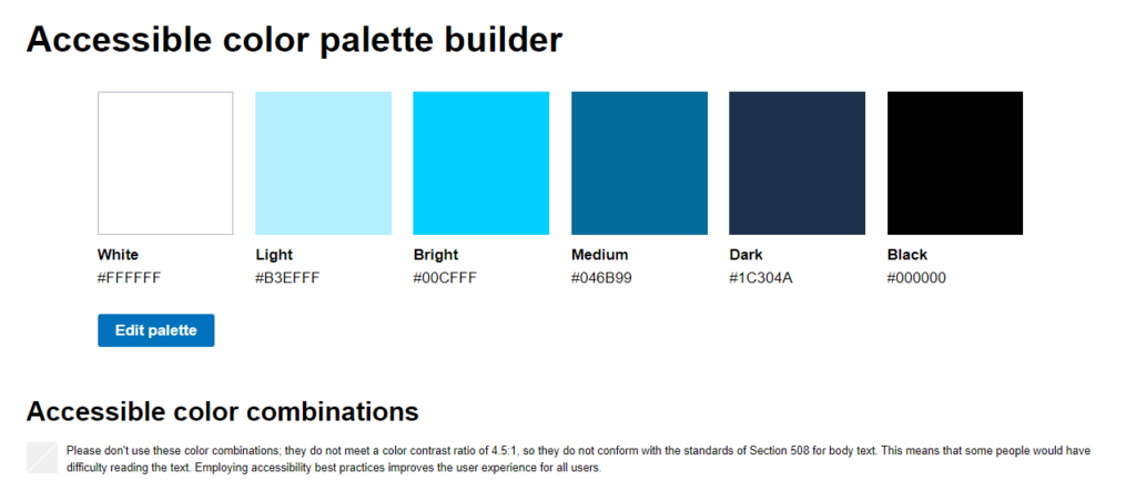
If you haven’t found your color palette yet, this tool from GitHub will help you build one. This contrast checker enables you to create a color palette with up to 6 colors.
Additionally, it displays the results of the palette using an easy-to-read table. Of course, your colors might not conform with each other.
But what’s good about this is that the tool provides a wide range of accessible color combinations. You can use this as a reference when building an accessible color palette.
How to Use Contrast Tools?
All the tools we’ve mentioned above are easy to use but have slightly different instructions. To use them, you’ll have to enter your colors’ hex values, allowing the tool to calculate the ratio between the colors.
Other tools allow you to edit the color values by adjusting the colors’ darkness, lightness, hue, and saturation.
Keep in mind that the small changes you make can impact your original colors. Expect that to be a few back-and-forths to get a color ratio that complies with standards and your brand identity requirements.
It should also be noted that some colors will pass as “large text only.” This means that your ratio will conform to WCAG as long as the font size is 14pt and bold or 18-t.
How to Boost Your Website’s Color Compliance

All in all, color contrast is a crucial element to consider if you want to attain and maintain website accessibility. But remember, it’s just one of the many adjustments you have to make to be ADA compliant.
You have to follow a long list of other compliance requirements related to alt text, hyperlinks, and more.
That said, achieving and maintaining an ADA-compliant website is a process, and the standards are constantly changing. While it can be difficult sometimes, it’s well worth the effort.
If you’re just starting, you can ensure website ADA compliance by using third-party solutions like accessiBe and Userway. These brands are leaders in the digital accessibility industry, ensuring your website complies with the latest accessibility standards.
| Existing Customers | ||
| Technology | Fully automated web accessibility solution | Fully automated web accessibility solution |
| Compliant in Countries | ||
| Compliance | WCAG | ADA | AODA | Section 508 | EAA | WCAG | ADA | AODA | Section 508 | EAA |
| Prices | Starts at From $49 | Starts at From $49 |
| Partner Program (for Web Agencies) |
|
|
| Customer support | Chat & Email Support | Chat & Email Support |
| Free Demo |
Yes Free demo available |
Yes Free demo available |
| Free Trial |
No credit card needed 7-day free trial |
Credit card required 7-day free trial |
You can start your journey by checking the accessibility status of your site on Accessibility Checker
Found this article helpful? Read more insightful resources below!