The Best Fonts for Dyslexia (Guidelines for Website Owners)


The International Dyslexia Association (1) states that around 20 percent of all people living in the United States have dyslexia symptoms, including poor spelling and writing and difficulty reading.
And even though these symptoms aren’t always linked to dyslexia per se, accessibility guidelines can improve the online experiences of all users who struggle with these types of issues.
Fonts may seem like a minor consideration when designing a website, however, it can make a world of difference to someone with dyslexia.
What Are Fonts for Dyslexia??
Fonts for dyslexia refer to the style and design of the font as well as letter spacing. These are all factors that determine how easy it is for someone to decipher what’s been written.
Numbers and letters that look similar can be the most difficult to decipher – p, q, g, and o being some of them. Some letter combinations can also look similar even though they’re spelling out different words.
There are several fonts that are currently preferred by the dyslexic community, but there are always improvements that can be made.
The idea with fonts for dyslexia is for the eyes to be guided with ease.
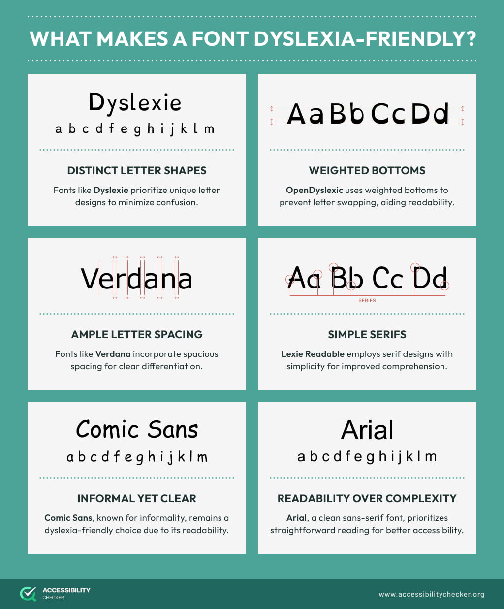
What Makes a Font Dyslexia-Friendly?
When we look at what font is best for dyslexia, there are a few common characteristics to look out for.
San-Serif. Serif refers to the small projections at the end of certain letters that make them look more professional – Times New Roman is an example of this. San-Serif is the opposite. Fonts that don’t have these projections are more spaced out, making them easier to read and dyslexia-friendly.
Non-Italic & Non-Oblique. Any font that has a slanted appearance is more difficult to read, even if it’s more stylized. Upright fonts are considered more dyslexia-friendly.
Monospace. Even though they’re more difficult to find, monospace fonts are preferred by people with dyslexia. This is because the letters take up the same amount of space horizontally, making them easier to decipher.
Fonts That Should Be Avoided for Dyslexia
Before we get into which fonts are good for dyslexia, let’s look at a few fonts you shouldn’t be using.
Neuland. Neuland dates back to 1923, so it’s been around a while, but you may recognize it from the Jurassic Park movie. It was particularly popular in the advertising space, but it’s not the best choice for sites that want to cater to dyslexic users. Not only is this an angular font, but it has some irregular shapes and curves too
Georgia and Times New Roman. Because both these fonts have serifs and are tightly packed, they’re not deemed to be dyslexia-friendly.
Papyrus. This hand-drawn font has been around since 1982 and has prominent round edges and horizontal strokes. The irregular curves are what make this font harder to read than others.
Onyx. This font combines thick and thin lines, creating a high contrast that is difficult to read.
Brush Script. Designed by Robert Smith, Brush Script isn’t dyslexia friendly because the letters are connected to each other and they’re italicized.
Broadway. Another font that boasts irregular shapes and curves is Broadway, another option that isn’t ideal for websites that want to cater to dyslexic users.
8 of The Best Fonts for Dyslexia
Now that you know what to avoid, let’s help you select one of the easiest fonts to read for dyslexia.
Dyslexie. This font was specifically designed for people with dyslexia. The font’s design reduces the possibility of letters being flipped or swapped, which is a common occurrence among online users with dyslexia.
OpenDyslexic. The weighted bottoms of OpenDyslexic, which is a free, open-source font, make it easier to orient letters.
Sylexiad. Created by Dr. Robert Hiller, this collection of fonts was based on in-depth research on dyslexia, making this an ideal choice for your site.
Comic Sans. Even though this is not a top choice among designers, it is within the dyslexic community due to the unique shapes of the letters – they’re really easy to distinguish.
Arial. This is a popular sans-serif font that can be found across a number of websites and documents.
Helvetica. Even though Helvetica is not monospaced, it’s still one of the clearest and easiest fonts to read due to its sans-serif nature.
Verdana. The wide letter spacing that Verdana offers makes it a popular choice among web designers and people with dyslexia. Verdana is also classified as a sans-serif font.
Calibri. This modern font is a default for Microsoft Word and a top choice among all users, including those with dyslexia symptoms.
The Role of Text-to-Speech Software

Over and above using the correct fonts, many dyslexic users can benefit from using text-to-speech software.
Software such as OrCam Learn Basic reads text aloud, helping dyslexic users better understand online content by listening rather than struggling with decoding written words.
Listening to text can be faster than reading, allowing dyslexic people to process information more quickly and efficiently. It can also help them maintain focus and reduce the mental strain associated with reading.
Tips for Writing for Dyslexic People
Once you select your font, there are some additional factors to consider to ensure your website and documents fully cater to dyslexic users.
Layout
Before we get into some tips on how best to write for people with dyslexia, here are some layout tips to keep in mind:
- Keep your sentences short and concise. No more than 70 characters is optimal.
- Opt to left align your text without justification. This creates even spacing between your words and makes it easier to spot the start of a new sentence.
- Use white space. Not only is white space a design best practice, but it makes your copy easier for dyslexic users to read too.
- Avoid columns. Stay away from laying out your copy in the same way a newspaper would.
- Use headers. Adding headers to lengthy copy helps break it up and makes it easier to read and scan.
Font Formatting
Even though you may have picked a dyslexia-friendly font, paying attention to formatting can also make a difference to readability.
A 12-14 point type is highly recommended.
Character spacing should equal around 30% of the letter’s horizontal dimensions.
Don’t italicize or underline text if you can help it.
Don’t type in all caps if you can avoid it.
Opt for line spacing of 1.5.
Writing
As you create your document or website copy, here are a few tips you can implement:
Keep it simple. Only use jargon if you really need to. Otherwise, keep your language simple, clear, and easy to understand.
Support copy with images. Another way that you can break up your copy and simplify complex ideas is to incorporate graphics. Infographics and flow charts are two examples.
Avoid abbreviations. While the right font will make abbreviations easier to read, it’s still best to avoid them where you can.
Add bullet points. Instead of writing out an entire list or instructions, opt for bullet points.
A Simple Adjustment for a Better User Experience
There is never going to be a one-size-fits-all user experience and it’s up to designers and website owners to ensure they’re not isolating people.
By simply taking the time to choose a font that’s easier to read, you’re already one step closer to creating a memorable and engaging experience for every person who visits your site.
FAQS
What Adobe font is used for dyslexia?
Myriad Pro is the dyslexic-friendly font that Adobe uses. This clean sans-serif font is easy to read and an ideal choice for businesses that want to cater to dyslexic customers and staff.