Inclusive Design: 8 Core Principles to Abide By


Many people tend to think that accessible design and inclusive design are one and the same. However, this is not the case.
For everyone to do their part in building more inclusive communities, it’s important to understand the key differences between these two terms.
In this blog, we will provide you with a better explanation of inclusive design, take you through key principles, and provide some examples of what you should and shouldn’t do.
What Is Inclusive Web Design?
Inclusive web design is a UX (user experience) principle. It requires designers to consider different environments and circumstances for user groups when designing digital products and platforms.
Inclusive design encompasses permanent, temporary, and situational factors that could prevent someone from being able to access and engage with a product or service.
Creating an inclusive design of any kind means designers need to steer clear of assumptions about gender, age, and race. Creating products based on assumptions is potentially offensive and leads to a poor user experience overall.
Why Inclusive Design Matters
Between 2017 and 2020, over 8,000 Americans had filed Disabilities Act Title III lawsuits. And, in 2021, this number grew by 14.3%.
This indicates that online users are no longer willing to accept inaccessibility and have a much better understanding of their rights.
Another study by WebAIM (1) highlighted that over 42% of online users felt that not much had changed in terms of accessibility and usability, with 18.5% of users stating that things have gotten worse. This shows that there is still a lot that businesses and website owners can do to better cater to all users, including the elderly population.
Inclusive design needs to be a key consideration for all businesses – here’s why:
- Brands that prioritize inclusive design can avoid costly lawsuits and unnecessary reputation damage.
- By focusing on inclusive design, you automatically have access to a larger target audience, which could increase sales.
- Inclusive design forces designers to go back to basics to create better products.
- When users feel heard and considered, it builds brand trust and credibility, which could lead to referrals.
- Websites that offer a more inclusive and engaging experience tend to rank higher in search results.
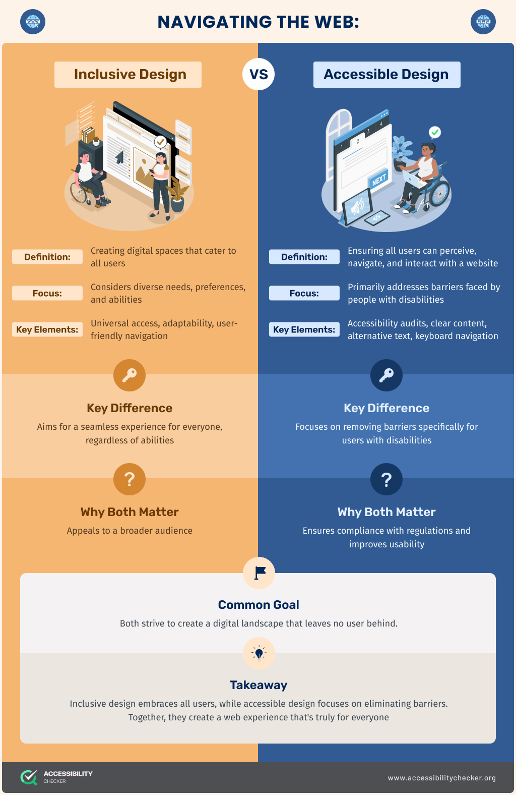
Inclusive Design vs. Accessible Design
Let’s unpack some of the differences between inclusive and accessible design.
Where accessible design only takes the disabled community into account, inclusive design is for everyone.
Accessible design centers on permanent disabilities such as hearing, motor, visual, and cognitive impairments. Inclusive design, on the other hand, centers on permanent, temporary, and situational disabilities.
For example:
- Permanent disability: A user who was born blind and relies on a screen reader.
- Temporary disability: A user who recently had an eye operation and requires an eye patch, temporarily impairing their vision to some degree.
- Situational disability: A user who is a stay-at-home mom and is distracted most of the time.
Then there’s the end product. Accessible design focuses on the user experience of the disabled community, whereas inclusive design is more of a methodology. It forces designers to consider how their designs would impact everybody, which means the user journey from start to finish is the most important.
Lastly, there’s the legal aspect. Accessible design is governed by specific laws and standards such as WCAG and the ADA, but these don’t always apply to inclusive design.
8 Core Principles of Inclusive Web Design
Here are the key standards you should adhere to when pursuing accessible design projects.
Keep Things Flexible
Your website needs to cater to all users. However, this doesn’t mean you need different versions for everyone either. Instead, you would need to focus on adding extra features.
One example is offering a simplified version of your website to mobile users. Another is adding captions to a video for deaf users or someone who can’t turn the sound on when watching a video because they’re at work.
Consider a User’s Environment
A person’s environment will also impact the user experience, which is why it’s important to consider situational challenges. Take an app, for example. Are there any situations where your ideal user would only have one hand free to use it? Taking these scenarios into consideration during the design phase would be an example of inclusive design.
Stay Consistent
It’s possible to still be creative and maintain a consistent website design. When elements look different to different users, it can cause frustration. It’s important to maintain consistency when it comes to your core website elements. Elements such as buttons and navigation can improve the usability of your site and increase conversion rates.
Give Users Some Control
The more control a user has over their experience, the more inclusive your website will be. There are a number of interfaces you can install that provide users with more control over the look and feel of your site. Using these panels, they can control color contrast, zoom function, and font size to cater to their needs.
It also helps to consider how you apply patterns and animations to your site as this could impact usability for some website visitors. Infinite scroll is an example of a function that could impact users who rely on keyboards and screen readers to engage with websites.
Reduce Errors
Focusing on inclusive designs helps reduce human errors. Your user interface should prevent errors whenever possible while still reducing any shame associated with making errors. This applies to any areas of your site where user input is required – buttons, CAPTCHA, and forms are some examples.
Are your buttons large enough to click on any device or when a user’s in a rush? Would a user know when they missed an important field that would prevent a form from being submitted? These are some elements to consider when designing an inclusive website.
Focus on Content Layouts
An inclusive website is one that allows visitors to find the information they need with ease. Consider how your content is currently laid out. Is it easy to scan and understand? If not, you may want to add more headers (in the correct order) and utilize bullet points and accordions.
Increase Value for Visitors
What features could you add to your site that would provide a more valuable experience? When deciding on valuable features, consider some of the most common features that a typical device has. Geolocation, microphones, and vibrations are just a few examples. Adding voice search capabilities is one way to create more value. This feature would benefit users who rely on screen readers as well as those who use Alexa, Bixby, or Siri.
Offer More Than One Choice
Choice and convenience go hand in hand when it comes to inclusive design. Provide users with more than one choice where you can without making the experience overwhelming. For example, you could provide the option of a button as well as swiping functionality to make a selection on your site or app.
Bad Examples of Inclusive Design
Now that you understand some of the core principles of inclusive design, let’s look at some websites that you shouldn’t use as an example.
The Daily Mail
While this is a reputable and popular source of the latest news in the UK, the site’s design is cluttered and the user interface is outdated.

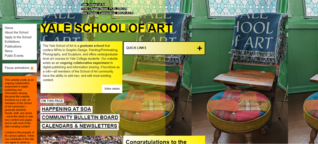
Yale School of Art
Designers of this site were certainly bold in terms of the layout and fonts, but it’s impacted readability and created brand inconsistencies.
Bulgari
While this website gets it right in terms of its high-end look and feel, the menu is overwhelming, has hover functionality, and takes up the entire screen.

Excellent Examples of Inclusive Design
Here are a few websites that got it right in terms of inclusive design.
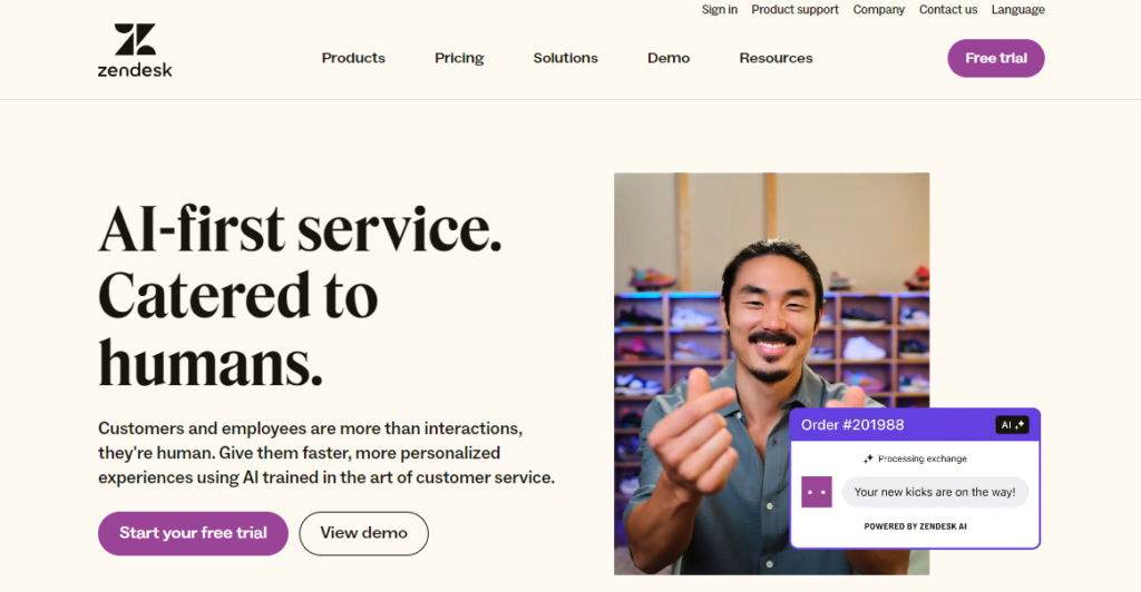
Zendesk
Zendesk’s website is visually appealing but still easy to use. The overall layout is simple and the navigation and all CTAs are clear. All images are also tagged with alt text and there is color recognition, which evokes meaning and emotion.
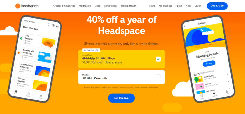
Headspace
Along with its accessibility features, the Headspace website is accessible on any device, has clear and simple navigation and calls to action, and offers a free trial. This caters to users who may be on a tight budget, but still value their mental health.
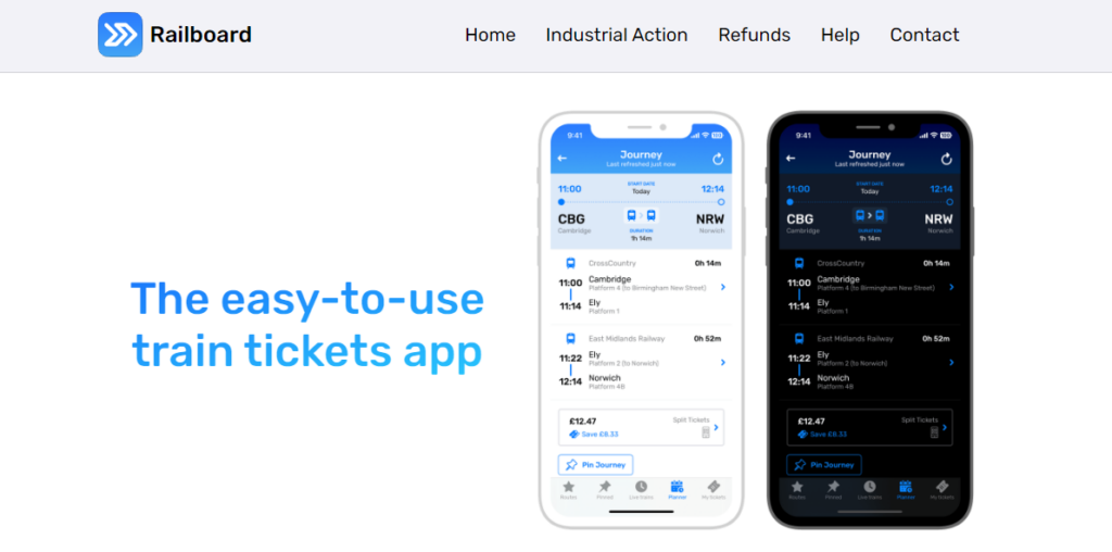
Railboard
Railboard is one of the most user-friendly apps for anyone who prefers to travel by train. Along with catering to disabled users, the app is also ideal for people who generally only have one hand free. The large buttons and clear and simple interface are perfect for anyone on the go.
In Closing
Inclusive design is essential if you want to cater to the disabled community as well as users experiencing situational and temporary disabilities. By applying these principles, you can create a product or website that people want to keep using and are highly likely to recommend.
Frequently Asked Questions
How does inclusive design benefit a business's bottom line?
Prioritizing inclusive design can lead to several business benefits. By making your product or website accessible to a broader audience, you gain access to a larger market, which can increase sales and revenue. Additionally, a strong focus on inclusive design builds brand trust and credibility, leading to customer loyalty and positive referrals. It also helps businesses avoid costly lawsuits and reputational damage, as demonstrated by the rise in Americans filing Disabilities Act Title III lawsuits.
What are some examples of inclusive design that go beyond digital products?
Inclusive design principles can be applied to physical products and spaces as well. For example, a bus stop with a digital screen that displays arrival times in both large font and braille serves multiple user groups. Another example is a playground with ramps and swings that can accommodate wheelchairs, allowing children with and without mobility impairments to play together. The core idea is to design for the full range of human diversity, considering different abilities and circumstances.
Does inclusive design mean I have to create multiple versions of my website or app?
Not necessarily. Inclusive design is about creating a single, flexible experience that can adapt to different user needs and environments. Rather than building separate versions, the focus is on adding features that give users more control over their experience. Examples include allowing users to adjust font size, color contrast, or offering voice search functionality. The goal is to make the core product adaptable and usable for everyone.
What are WCAG and the ADA, and how do they relate to inclusive design?
WCAG (Web Content Accessibility Guidelines) and the ADA (Americans with Disabilities Act) are specific laws and standards that primarily govern accessible design. While inclusive design is not always legally mandated in the same way, adhering to standards like WCAG can help a business create a more inclusive experience. Accessible design is a component of inclusive design; it focuses on meeting the needs of people with disabilities, which is a key part of designing for everyone.