The Principles of Neurodivergent UX Design Every Designer Should Know


Have you ever stared at a cluttered interface and felt your brain just… refuse to cooperate?
For neurodivergent users, that experience isn’t occasional frustration. It’s the norm.
Neurodivergent UX design is a set of principles that puts cognitive accessibility at the center of the design process, ensuring you can create digital experiences that work for brains that think, focus, and process information in all kinds of different ways.
Regardless of whether you’re designing for someone with ADHD, autism, dyslexia, or sensory sensitivities, the same core ideas apply, and they’re simpler than you might think.
What is Cognitive Accessibility?
In a nutshell, cognitive accessibility refers to designing interfaces that are easy to understand, navigate, and interact with for people who experience differences in how they think, learn, and process information.
Where physical accessibility asks “can a person physically reach or perceive this?”, cognitive accessibility asks “can a person actually understand and use this?”
That distinction matters because the challenges are fundamentally different.
Cognitive accessibility accounts for things like memory load, sustained attention, problem-solving demands, and language processing, all of which vary from person to person.
And the need is substantial. Around 5.4% of the US population reports a cognitive disability, and that’s only counting those with a formal diagnosis. Factor in the broader neurodivergent population, and the picture gets much bigger.
The gap between need and reality is stark, too. According to WebAIM’s 2026 analysis of one million websites, the average homepage contains 56 detectable accessibility errors, with low-contrast text and missing input labels among the most prevalent issues.
Cognitive accessibility isn’t a niche concern. It’s the foundation of the genuinely usable design principles that form the basis of WCAG.
UX Design for ADHD (Attention Deficit Hyperactivity Disorder)
For users with ADHD, it’s not a lack of intelligence or effort that creates a potentially frustrating online experience. It’s that many interfaces are designed in ways that actively work against how the ADHD brain functions.
Distraction is everywhere, tasks often require holding multiple steps in mind at once, and working memory tends to be shorter and more easily disrupted.
The result? Users who lose their place, abandon forms halfway through, or simply leave a site feeling overwhelmed. Good UX design can change that entirely.
Actionable Tips
- Minimize Distractions: Auto-playing videos, aggressive animations, and pop-ups are among the biggest offenders for ADHD users. Keep your interface calm and intentional. If an element doesn’t serve the user’s current goal, it probably shouldn’t be there.
- Clear Task Flows: Long, complex forms are particularly challenging for users with ADHD. Breaking them into step-by-step wizards reduces cognitive load in a big way and makes completion feel manageable rather than daunting.
- Progressive Disclosure: Presenting everything at once is overwhelming. Lead with only the most important information and let users choose to reveal more detail as they need it.
- Forgiving UI: Mistakes happen more easily when attention and working memory are stretched. Make it simple to undo actions, go back a step, or correct an error without penalty. Error messages should be impossible to miss.
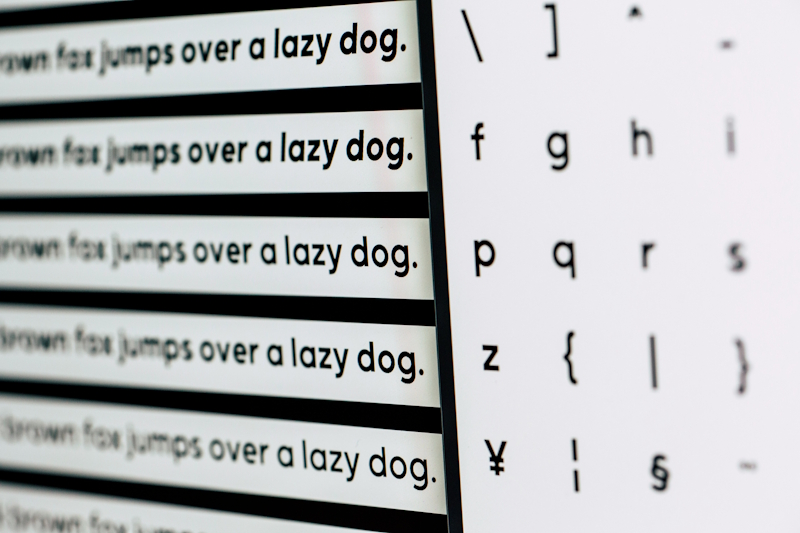
Dyslexia-Friendly Typography and Layouts
Dyslexia is one of the most common learning differences in the world, yet most digital interfaces are still built in ways that make reading harder than it needs to be.
The good news is that the typographic and layout choices that help dyslexic users read more comfortably also tend to make content clearer for everyone.
As UX researcher Debra Gelman puts it:
Plain language (shorter sentences, words with fewer syllables, use of common phrases) can help with reading comprehension for all users.
Actionable Tips
- Font Selection: Sans-serif fonts like Arial, Verdana, and Comic Sans are widely recommended for dyslexic readers because their letterforms are cleaner and more distinct. Specialized fonts like OpenDyslexic take this further by weighting the bottom of each character to help anchor letters on the baseline.
- Line Spacing & Length: Tight lines are one of the biggest culprits for visual crowding. A line height of at least 1.5 gives the eye enough room to track from one line to the next without losing its place. Similarly, keeping line lengths to around 70–80 characters prevents the long horizontal eye movements that increase reading fatigue and errors.
- Alignment: Justified text creates uneven gaps between words that can make lines appear to move or fragment for dyslexic readers. Always left-align body text to give the eye a consistent, predictable starting point on every line.
- Visual Hierarchy: When you need to emphasize text, reach for bold rather than italics or ALL CAPS. Italics tilt and distort the shape of letters, and all-caps remove the natural outline of words that many readers rely on to recognize them at a glance.
UX Considerations for the Autism Spectrum
Autism is a spectrum, which means the way it presents varies enormously from person to person. But there are common threads that UX designers need to understand.
Many autistic users are highly sensitive to sensory input, meaning a flashing banner or an unexpected sound can be genuinely distressing rather than merely annoying. Ambiguity in language and layout creates anxiety rather than just mild confusion.
And interfaces that behave unpredictably can make what should be a simple task feel completely overwhelming.
Actionable Tips
- Predictable Navigation: Keep your navigation menus, search bars, and key interface elements in exactly the same position on every single page. When a user knows where to look, they can focus their cognitive energy on the task at hand rather than reorienting themselves every time the layout shifts.
- Clear, Literal Microcopy: UI copy that relies on idioms, metaphors, or sarcasm can be genuinely confusing for autistic users who tend to interpret language literally. Phrases that feel natural to neurotypical users, like “We’ll be in touch,” “Ball’s in your court,” or playful error messages like “Oops, something went a bit wonky!”, can create real uncertainty about what is actually happening or what the user needs to do next.
- Sensory Management: Bright, high-contrast color schemes and neon palettes can be overwhelming for users with sensory sensitivities. Opt for soft, muted tones that are easy to look at for extended periods, and always offer a Dark Mode option. Beyond color, be mindful of motion: auto-playing animations, looping videos, and sudden transitions can cause real sensory distress.
- Descriptive Buttons: Vague calls to action like “Click Here” or “Submit” force users to infer what will happen next, and for autistic users, that uncertainty can create hesitation or anxiety. Every button and link should clearly describe the action it triggers and the outcome it leads to. “Download the PDF Guide,” “Create Your Free Account,” or “Return to Homepage” leave no room for guesswork.
The “Curb-Cut Effect” of Cognitive Accessibility
The curb-cut effect gets its name from a simple piece of urban infrastructure. When cities began cutting slopes into pavement curbs to help wheelchair users navigate the streets, something unexpected happened. Cyclists, parents with pushchairs, delivery workers, and travelers with rolling luggage all benefited too.
The same principle plays out in digital design, and cognitive accessibility is one of the clearest examples of it. When you design an interface that works for a neurodivergent user, you’re not creating a niche experience. You’re creating a better experience for every single person who uses your product.
Consider a step-by-step checkout flow designed with an ADHD user in mind. Shorter forms, one task per screen, clear progress indicators, and minimal distractions.
Now picture a neurotypical user attempting the same checkout at the end of a long workday, tired, stressed, half-distracted by a phone notification. That person benefits from exactly the same design decisions for entirely different reasons.
The data backs this up. According to the Baymard Institute, the average large-scale e-commerce site could improve its conversion rate by up to 35% through better checkout UX alone. These are the same principles that sit at the heart of neurodivergent-inclusive design.
This is what makes cognitive accessibility such a compelling business case, not just a moral one.

How to Test Your Site for Cognitive Accessibility
Knowing the principles of cognitive accessibility is one thing. Knowing whether your site actually delivers on them is another.
Automated Tools: An Important Starting Point
Automated accessibility checkers are a valuable first line of defense. The AccessibilityChecker.org platform can quickly surface issues that are likely to create friction for neurodivergent users because we’ve built our tool based on the Web Content Accessibility Guidelines, as well as general best practices.
Running a scan before anything else gives you a clear baseline and helps you prioritize the most obvious fixes without having to manually comb through every page.
That said, automated tools can have real limits when it comes to cognitive accessibility specifically.
A tool can flag that your sentences are long, but it can’t tell you whether your microcopy is ambiguous to an autistic user. It can detect a missing alt tag, but it can’t assess whether your navigation is predictable enough for someone with ADHD.
Automated testing is where you start, but not where you finish.
Manual Testing: The Gold Standard
The most meaningful cognitive accessibility insights come from testing with real neurodivergent users.
This means recruiting participants who have ADHD, autism, dyslexia, or other cognitive differences, and observing how they actually navigate and interact with your product.
This kind of testing doesn’t need to be elaborate to be valuable. Even a handful of moderated sessions with neurodivergent users will surface issues that no automated tool would ever catch. The goal isn’t to design what you think works for them. It’s to find out what actually does.
A practical approach is to combine both methods: use automated scanning to handle the technical groundwork, then layer in manual testing to catch what the tools miss. Together, they give you a much more complete picture of how your site performs across the full spectrum of cognitive experience.
Good Design Doesn’t Pick and Choose Who It Works For
Neurodivergent UX design isn’t a trend, a checkbox, or a nice-to-have feature reserved for products with a specific audience in mind. It’s a fundamental rethink of who we’re designing for.
When you design for the person who finds your interface hardest to use, you raise the floor for everyone.
Clearer copy, calmer visuals, predictable navigation, and forgiving flows don’t just help users with ADHD, autism, or dyslexia get through your product. They make your product genuinely better for every tired, distracted, or overwhelmed person who lands on your site on any given day.
Start with an audit. Run your site through AccessibilityChecker.org to see where you currently stand. Then take what you’ve learned here and start building interfaces that work for every kind of brain, because that’s exactly what good design does.