10 Best Examples of ADA Compliant Websites in 2026



Not only does web accessibility compliance protect you against litigation, but it helps you promote inclusivity too.
Even though attaining website accessibility can be a little overwhelming and daunting at first, it’s not an impossible task, especially when you have tools like accessiBe and ACE™ Scanner to assist you.
In today’s article, we’ll show you some of the best examples of ADA-compliant websites and what they have in common.
What Does Having an ADA Compliant Website Mean?
Having an ADA-compliant website means your site can be used by everyone, including people with visual, auditory, motor, and cognitive disabilities. In practice, this involves meeting the Web Content Accessibility Guidelines (WCAG), which is the technical standard that courts and regulators consistently point to when determining whether a website meets ADA requirements.
Compliance isn’t a single feature or a one-time fix, either. It covers everything from how your images are labeled and how your content is structured, to whether users can navigate your site without a mouse and if your text is readable against its background. Every element that a sighted, hearing, able-bodied user takes for granted needs to work equally well for someone using a screen reader, keyboard navigation, or other assistive technology.
At its core, ADA compliance is about removing barriers. A website that meets these standards isn’t just legally protected. It’s genuinely more usable for a broader audience.
How to Create an ADA-Compliant Website
Before we delve into some examples of ADA compliant websites, let’s look at a few of the top recommended accessibility tools. With the right tools and resources, you can also become an example of a website that complies with accessibility regulations.
1. ACE™ Scanner
If you’re looking for an accessibility platform that pairs automated testing with AI-powered remediation, consider ACE™ Scanner. After scanning your site against WCAG, ADA, and Section 508 standards, ACE surfaces the specific issues found and pairs them with SmartFix™, which generates ready-to-implement fixes for your team to review and ship. An auto-updating accessibility statement is generated for your site through LiveStatement™, and every scan and fix is logged in Compliance Vault™ so you have audit-ready documentation on hand whenever you need it.
2. accessiBe
If you’re searching for an affordable and easy-to-use accessibility tool that complies with WCAG, ADA, and Section 508 requirements, consider accessiBe. After a quick installation process, you can have a compliant website within 48 hours and a full accessibility statement that you can display on your site. An accessibility panel on the front end of your website is what will allow visitors to customize their experience according to their needs.
If you want to make your website ADA compliant, here are some additional steps you can:
- Study these examples of websites thoroughly. The sites we’ve listed above are some of the best examples of ADA-compliant websites. Use them as inspiration as you build your website or redesign your existing site.
- Decide on the right tools. The best first step is to test how your website fairs against web accessibility standards. There are a number of tools that you can use to scan your site, including ACE™ Scanner, which also has an AI-assisted remediation feature called SmartFix™.
- Consult with an accessibility agency. Accessibility agencies offer services that can help you build an accessible website for all. Most agencies offer audits and remediation services.
- Utilize widgets and plugins. Widgets and plugins help you maintain an accessible website more easily. They can help you personalize your site’s content and elements, ensuring your users get the best possible experience. You can also utilize accessible forms (1) to make sure every user has equal access to this type of functionality.
Top 10 ADA Compliant Website Examples
If you’re looking for ADA-compliant websites that are functional and visually pleasing, we’ve got you covered.
Below are just a few of the best websites you can learn from on your compliance journey.
1. Patagonia

Patagonia is a mid-sized outdoor apparel brand with a long-standing commitment to doing things the right way, and their approach to web accessibility reflects that ethos.
What sets Patagonia apart is the depth of their commitment: they go beyond minimum compliance by offering an assistive technology application that provides tools like mouse and keyboard replacements, voice recognition, and hands-free navigation, all free to download. For a retailer, this level of proactive investment in assistive tools is rare.
2. National Federation of the Blind (NFB)

It’s fitting that the National Federation of the Blind runs one of the more rigorously accessible websites on the internet, and they hold themselves to the same standard they advocate for others.
The NFB’s site targets WCAG 2.1 Level AA conformance and undergoes regular accessibility reviews, including testing by people who rely on assistive technology daily. What the site does particularly well is alt text: every image includes short, descriptive, and contextually relevant descriptions that screen readers can read aloud or convert to Braille.
The NFB also favors accessibility-first third-party vendors, ensuring that their compliance extends beyond their own code to the tools they depend on.
3. Scope

Scope is a UK-based disability equality charity, and their website is a strong example of an organization whose digital presence genuinely reflects its mission.
The site is built with accessibility woven into its design from the ground up, not bolted on as an afterthought. Scope uses high color contrast throughout to meet WCAG contrast ratios, ensures all navigation is keyboard-operable, and structures content with a clear, logical heading hierarchy that works well with screen readers.
Their commitment goes even further: Scope actively shares its approach to accessible content with other organizations, helping raise the bar for accessible design across the sector. For nonprofits looking for a model to follow, Scope is an excellent reference point.
4. Vasa Museum

The Vasa Museum in Stockholm is a world-famous cultural institution that has made digital accessibility central to its online experience.
One standout feature is its breadcrumb navigation, which clearly shows users where they are within the site’s structure at all times, which is particularly valuable for users with cognitive disabilities who may lose orientation on multi-level sites. The site also offers communication boards to help users plan their visit, caters to international audiences with clearly labeled multilingual content, and ensures that its ticketing and booking flows are operable without a mouse.
5. RNID

RNID is a UK-based charity supporting people with hearing loss, and their website is a standout example of thorough, mission-aligned accessibility, particularly impressive for a medium-sized nonprofit.
The site commits to WCAG 2.1 Level A and AA compliance and undergoes user testing conducted by blind and partially sighted people, not just automated scans. What RNID does especially well is text resizing: users can scale text up to 300% without breaking the layout or losing functionality, meeting WCAG Success Criterion 1.4.4 (Resize Text).
The site also provides alternative formats for PDF documents and works actively with third-party vendors to bring their accessibility up to standard.
6. Lakers Store

The Lakers Store is one of many top ADA-compliant websites that believes everyone deserves equal access to the internet and all that it offers. And because eCommerce stores are generally a hot target for ADA lawsuits, the site adheres to the Web Content Accessibility Guidelines (WCAG 2.2).
The site is compatible with screen readers and keyboard navigation. It is also epilepsy friendly and allows for font and color adjustments as well as audio muting.
7. Us.Tomy

Tomy is serious about its mission to make the world smile and having an accessible website is a big part of that.
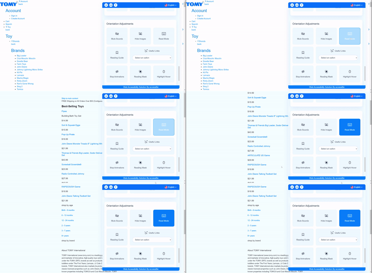
By accessing an accessibility adjustment panel, website visitors are able to make content and color adjustments that meet their needs, mute sounds, and activate profiles that cater to specific disabilities.
8. PlayStation
All the gamers out there will be happy to know that PlayStation Gear is another site that complies with accessibility standards.
With the help of accessiBe, website visitors can shop in a way that works for them. An accessibility adjustments panel is immediately available upon visiting the site, allowing users to tailor their online experience to their needs with the help of various disability profiles and settings options.

9. Chick-fil-A
If you’re a fan of chicken sandwiches, you’re probably familiar with Chick-fil-A, a brand that is serious about web accessibility.
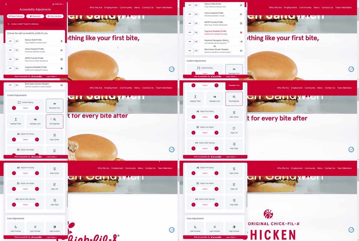
Using an accessibility panel from accessiBe, website users are easily able to personalize their online experience. Along with adjusting font sizes and on-page color contrast, visitors can turn on specific profiles that cater to different types of disabilities. The brand’s accessibility statement is also readily available via this panel.

10. Six Flags
Even though Six Flags is known for its memorable amusement parks, they still prioritize the online user experience too.
The moment a user lands on the Six Flags site, they can read through their accessibility statement and change up the site to make it easier to navigate and engage with. From scaling content and magnifying text to muting sounds and hiding images, there are multiple accessibility options to choose from.
Publishing a clear, current accessibility statement, one that updates automatically as your site changes, like LiveStatement™, is a practice worth borrowing from Six Flags’ approach.

Common Features Among ADA Compliant Websites
Now that you’ve seen a few top ADA-compliant compliant website examples, it’s time to take a closer look at some of the features they have in common.
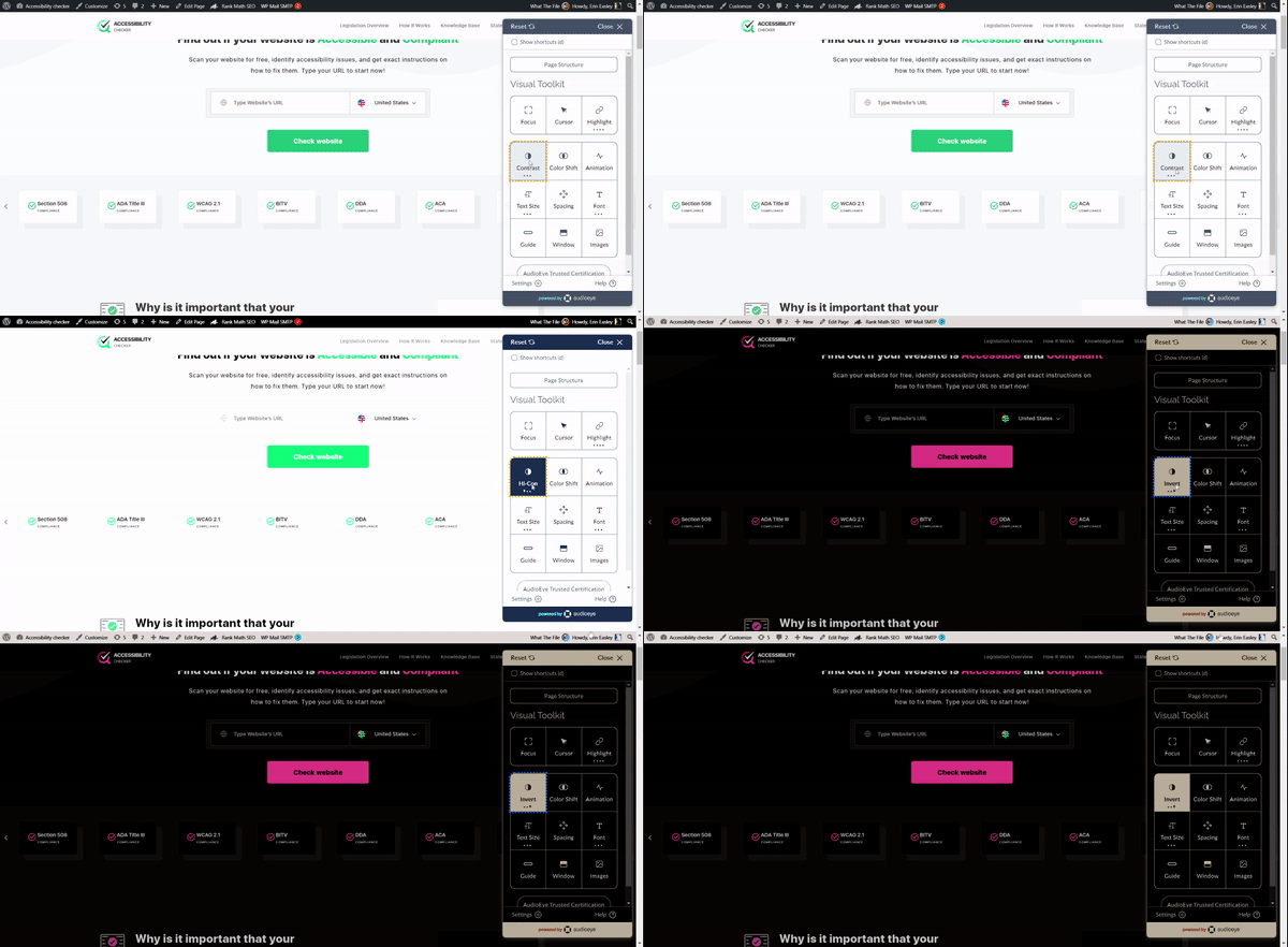
1) Color contrast ratio
A huge problem for people with visual impairments is that they can’t always read text without a high background contrast. For example, if a logo is embedded within an image, it may be impossible to distinguish.
Additionally, colors are important for users with color blindness. Thus, you must keep interaction simple and engaging for users who can’t differentiate between colors.
According to the WCAG, regular text on websites should have a color contrast ratio of at least 4.5:1 with the background or adjacent colors.
Lastly, go beyond using colors alone to convey information or instructions. We recommend using AudioEye design tactics to help users easily identify elements on your website.
2) Consistent navigation
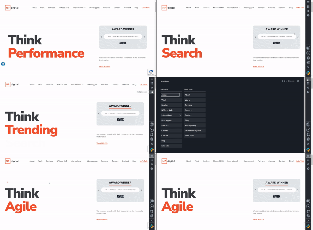
When driving to a specific destination, we depend on consistent signage – speed limit signs, warning signs, and stop signs. If you need to know how to get from A to B, these guideposts make your life easier.
Just like driving, websites have navigation that helps users get from point A to point B.
Providing users with easy navigation, including site search functionality and sitemaps, is another way to create an ADA-compliant website.
You should also make sure that your labels, styles, and positions are consistent.
3) Simple headings and spacing
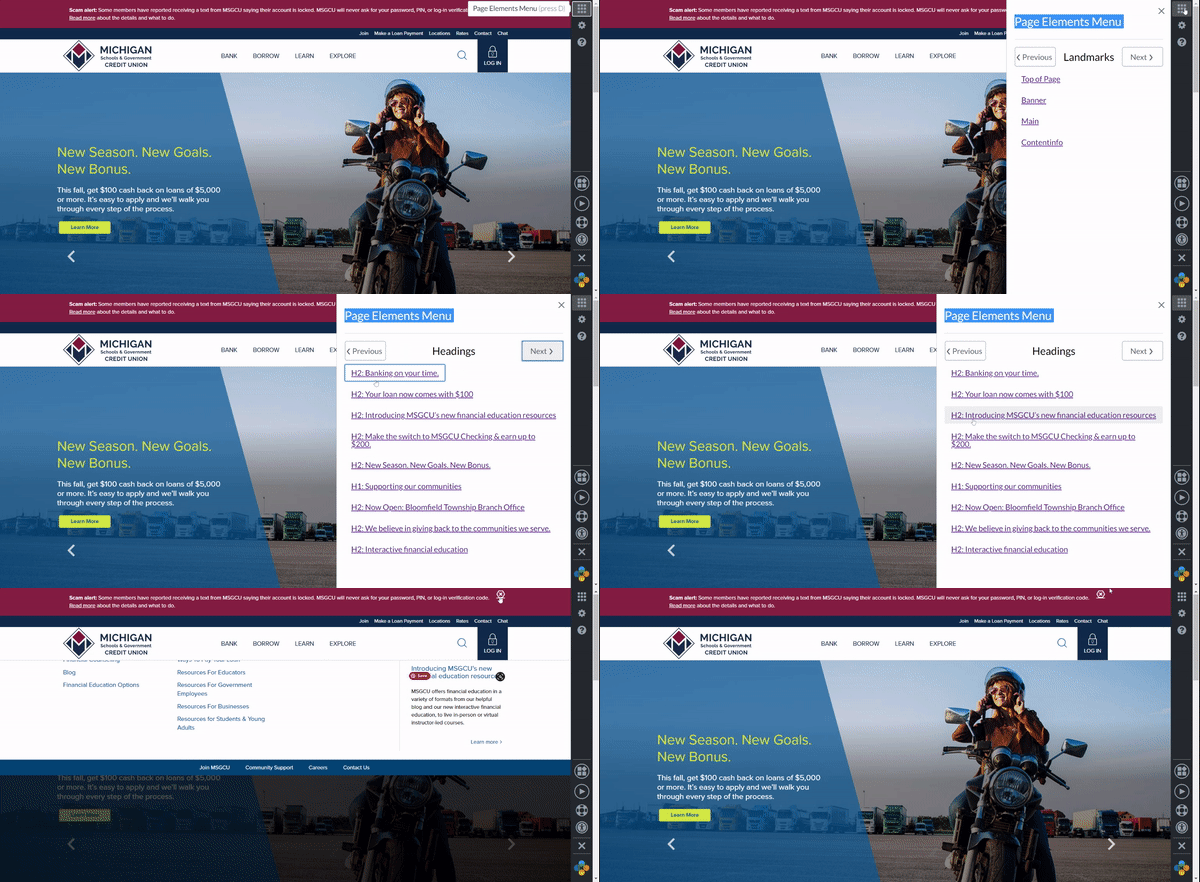
Good design helps users recognize your hierarchy of information. It also ensures they understand the relationship between headlines and your site’s elements, including text and images.
Content is also more accessible when using heading styles, white space, and placing elements strategically to reduce clutter. It’s important to ensure that the HTML tags for headings are hierarchical too. The headings on Michigan Schools and Government Credit Union are a good example, as they effectively show the hierarchy of the site’s content.
4) Provide alternative text
Creating and delivering a visually pleasing experience is crucial for online businesses. Because of this, businesses use videos and images to enhance their content.
However, many online users are visually impaired and use screen readers to help them access online content and services. This is where alternative text and transcripts come in. They enable screen readers to present the content in an auditory format, aiding visually impaired users.
5) Adaptability for different devices
Google rewards websites for mobile-optimized design, but that doesn’t mean you should leave out desktop and other platforms. For narrow views, display primary content in one or two columns, and offer secondary content through icons and links.
KissMyKeto effectively uses this capability, providing mobile users with a more accessible view of the site.
6) Empower users
Carousels are a visually engaging way to display text and images online. However, visually-impaired users experience difficulties with scrolling content.
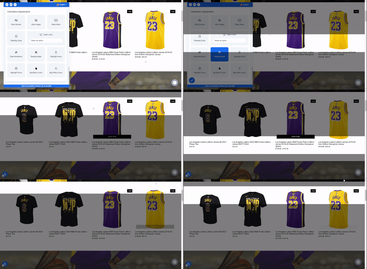
Accessible scrolling can be seen on the Lakers Store. It allows users to control and pause the scrolling header manually.
7) Offer alternatives for consuming media
Transcripts of audio and video content are more engaging for users with hearing or visual disabilities. You can also provide different formats for your transcripts.
This is a simple way to make your content accessible to people with disabilities and create an ADA-compliant website. Additionally, accessing the audio transcript of a video or an audio description of a table should be easy.
8) Keep updating your website every 3 months
The required accommodations for disabled users keep evolving. With this, accessibility guidelines and standards change too.
For this reason, it’s essential to remain up to date with the latest guidelines and update your website regularly to ensure your website is always compliant.

A Fast and Efficient Way to Comply with Web Accessibility Guidelines
Our top-recommended web accessibility solution is accessiBe. This advanced AI-powered tool makes it easier to apply the latest WCAG standards to your site by simply adding a line of code to the back-end.
Busting Myths Related to ADA-Compliant Websites
Even though web accessibility isn’t a new concept, there are still a lot of myths and misunderstandings that persist about what it entails.
Myth: An accessible website is not visually appealing.
This is simply not true. A website can be both accessible and visually appealing.
We’re now able to design websites that are easy to use, even for the most visually impaired.
Additionally, remember that your visitors will be impressed by your website’s accessibility, not just your site’s looks.
Myth: Accessible design compromises functionally.
Contrary to popular belief, an accessible website can be fully functional. You can create beautiful, functional, and accessible websites using a set of different parameters.
This myth stems from the notion that creating an accessible website is very complex. However, building an accessible website and having full functionality are not mutually exclusive.
You can achieve both functionality and accessibility simultaneously with the help of accessibility plugins and widgets.
Summary
In the current digital era, website accessibility should be a priority for everyone.
The websites we’ve shared are just some of the prime examples of ADA-compliant websites and should serve as inspiration for your own site.
Find out where you stand on your web accessibility journey by conducting an audit of your website
What makes a website ADA compliant?
Following WCAG 2.2 Level AA is the standard that most websites should aim for. This level includes keyboard nav, screen reader support, adding alt text, applying the right color contrast, and using the appropriate form labels.
Are there really ADA compliant websites?
Yes, but most large sites have at least minor issues. The examples in this post are among the most compliant we've audited.
How do I make my website ADA compliant?
The best approach is to run a scan, fix critical issues, retest your site with screen readers, document your work, and monitor it continuously.
