accessiBe is one of the most talked-about web accessibility tools available today. It helps take a lot of the manual work out of adhering to ADA and WCAG guidelines by making it quicker and easier to identify web accessibility issues on your site.
13 Modern Accessible Website Examples to Inspire You
#Accessiblewebsite #adacompliance
Our methodology
Written and researched for humans by humans

Casandra Visser
Author

Ritvik Shrivastava
Researcher

Pedro Velhinho
Expertly reviewed by
Comments:
0
When you consider the fact that roughly 16 percent of the world’s population (1) is living with some form of disability, it quickly becomes clear why website accessibility design should be a critical consideration for all businesses and website owners.
The Web Content Accessibility Guidelines (WCAG) now form the basis of digital accessibility standards across the globe and are mentioned in countless ADA lawsuits, further emphasizing their importance.
Ready to make a change to the user experience on your site?
This blog will unpack some web accessibility basics and share some top accessible design examples to inspire you.
What is Website Accessibility?
Web accessibility refers to using tools and technologies to develop websites that cater to the disabled community.
A disabled site visitor, just like any other visitor, should be able to understand, perceive, navigate, and interact with the content on your site whether it’s viewed on a mobile or desktop device.
Web accessibility covers all forms of permanent disabilities, including physical, hearing, speech, visual, cognitive, and neurological. However, even people with temporary impairments can benefit from a site that adheres to digital accessibility standards.
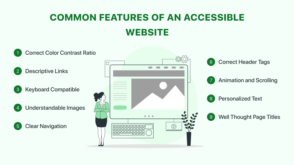
What Do Accessible Websites Have In Common?
When we compare the best accessible websites side by side, we can see that they generally have a few key elements in common.
Color Contrast Ratios are Correct
It’s no secret that a website needs to be visually appealing and there are so many ways to achieve this, but a striking design might not always work for a user with low vision.
According to WCAG, the recommended color contrast ratio between the background of your site and the foreground text should be 4:5:1. Large-scale text and images of large-scale text should have a contrast ratio of at least 3:1.
There are no color contrast requirements for text that forms part of a logo or brand name.
If you want an easy way to check your site’s current color contrast ratios, you can use this color contrast checker tool.
Links are Descriptive
A number of users who browse your website will do so with the help of a screen reader. Screen readers assist those with low vision or cognitive difficulties by reading out the text on their screen, which includes links.
When the hyperlinked text on your site is not descriptive, it can create a confusing experience. For example, instead of simply hyperlinking the words “Click Here”, it’s better to hyperlink several words that explain exactly what a link does or where it’s leading.
They’re Keyboard Compatible
Users who have poor fine motor skills are often not able to use a mouse to navigate a website. For this reason, an accessible site is one that can be easily navigated using just keyboard controls (2). This would also include on-screen keyboards and keyboard emulators such as speech input software.
Images are Understandable
Images are another on-site element that screen readers will typically interact with, which is where alternative text comes in.
Alt text is a description of an image on your site that’s embedded into the HTML code. When a description is present, a screen reader can provide a user with more context about what’s on the screen. If your images only have long and confusing file names, this is what is read out to your visitors.
Alt text should always be short, descriptive, and relevant to the rest of the content on the page. For images that don’t require alt text and wouldn’t make a difference to the user experience, a blank alt attribute can be used.
Navigation is Clear & Simple
Most online users have a short attention span, but this can be amplified in people with cognitive or neurological disabilities.
For this reason, it’s critical for a site’s navigation to be simple and for all primary navigation options to be present on any given page. Breadcrumbs are also a good way to ensure a user always knows where they are on your site and how to get back to where they were.
The Correct Header Tags are Used
Header tags (3) such as H1, H2, and H3 not only make it easier for any visitor to read the text on your site, but they’re also helpful to anyone who is using a screen reader.
Using the correct header tags in the right order will ensure a disabled user can clearly understand the flow and importance of the text on a page. It’s also important to not skip heading ranks or a screen reader could read out the text incorrectly.
Animations & Scrolling Content Can Be Paused
Using elements such as carousels and animated graphics or videos is a good way to include a lot of information on a page. However, it can be difficult for some users to engage with it.
While you don’t need to stop using this type of content, it’s important for a visitor to have the ability to pause, stop, or hide it if need be. This is another guideline outlined in WCAG.
Text Can Be Personalized
Visitors with low vision can have a hard time engaging with small text, which is why accessible websites make it possible for someone to scale text to their needs.
WCAG also recommends that web designers avoid using images to display text and that if a user does resize any text it’s still visible on the screen without having to scroll horizontally.
Page Titles are Well Thought Through
If you’re familiar with search engine optimization principles, you will know how important a good page title (4) is. However, disabled users rely on good page titles too as it’s the first thing a screen reader will read out when someone lands on a page.
When writing a page title, make sure that it’s descriptive but still specific enough that anyone can understand it.

A Fast and Efficient Way to Comply with Web Accessibility Guidelines
Our top-recommended web accessibility solution is accessiBe. This advanced AI-powered tool makes it easier to apply the latest WCAG standards to your site by simply adding a line of code to the back-end.
How to Test for Web Accessibility
If you’re just getting started with web accessibility, you might be wondering where your site stands and how much work you need to do.
Fortunately, there are a number of free and paid tools available that can instantly scan and audit your website, bringing your attention to glaring accessibility issues in a detailed report. Your site will also be ranked at Level A, AA, or AAA, with Level AA being ideal for most websites.
Your site can then be automatically or manually remediated, depending on the accessibility tool you decide to use. Here are five top accessibility checkers to consider as you get started with ADA compliance.
13 Accessible Web Design Examples to Inspire You
Now that you have a better understanding of the basic requirements that an accessible site should meet, let’s delve into some of the best accessible websites.
1. Patagonia
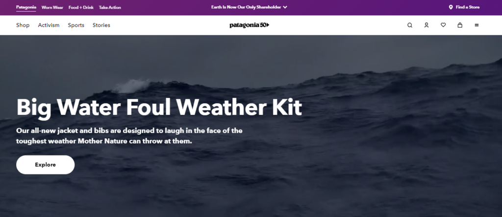
Patagonia, a leading outdoor clothing company, is a top example of an accessible eCommerce site.
For one, the text offers high contrast, all images have the necessary alternative text, and the pages are well structured, making it easy for anyone to navigate the website.
An accessibility statement can also be found in the footer of the site for anyone who wants to learn more about the steps they have taken to provide a more accessible experience to customers.
2. SnackNation
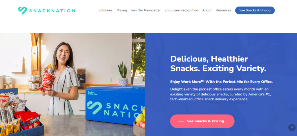
For anyone looking to deliver snacks to friends, family, or team members, SnackNation is a fan favorite.
One stand-out accessibility feature of this site is how it caters to users with cognitive impairments such as ADHD and autism.
With the help of accessiBe, a popular accessibility tool, the site allows users with cognitive difficulties to only focus on the critical elements of the site. Using the accessiBe panel, shoppers can box out headers and menu bars, helping them limit distractions and enjoy a simpler browsing experience.
3. EventBrite
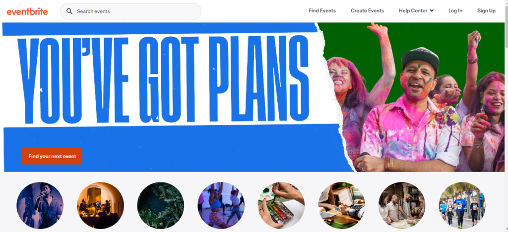
When it comes to accessible web design, event management platform, EventBrite, really gets it right.
Not only are the layouts clean and easy for anyone to understand and navigate, but visitors also have the option to skip content where they need to. This means the brand can still use fun and engaging animated content without excluding users with cognitive and visual disabilities.
4. Scope
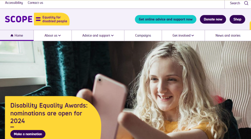
It is clear from the offset that Scope is passionate about doing its part for the disabled community.
Their accessibility statement outlines that they comply with WCAG 2.0, WCAG 2.2, and BS 8878 and that users have the option to personalize their browsing experience according to their needs.
Scope didn’t need to compromise on having a slick and colorful brand. Instead, they focused on color contrast, simple navigation, and alternative text to ensure all visitors have an equally engaging experience.
5. Lonely Planet

Lonely Planet is another site that has implemented an accessibility panel to ensure visitors can adjust the functionality and visual aspects of the site in a way that works for them.
One example of a feature on this panel is the ADHD-friendly profile, which helps eliminate distractions that might cause an unpleasant browsing experience. Turning on this profile makes it easier for a user to only focus on the elements that are most important on any given page.
The simple navigation is another reason why this is considered one of the best accessible websites.
6. BBC
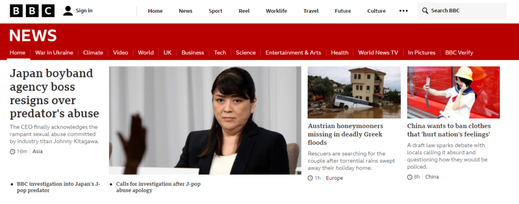
BBC News is never short on traffic and many of these visitors are disabled, which is why accessibility has always been a priority.
This is one example of a site that can be navigated using only a keyboard. With the help of the Tab key, a user can easily cycle through all the elements on a page without having to use a mouse.
You will also see that every image has clear and descriptive alternative text for visitors who rely on screen readers.
7. Pacific Life
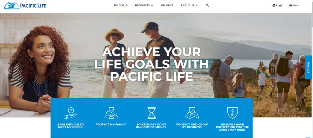
Pacific Life, an organization that deals with life insurance, annuities, and workforce benefits, has ensured they’re not alienating visitors based on ability through the implementation of the EqualWeb accessibility panel.
Specific features can be accessed via the panel based on different impairments. One example of a feature is Read Mode, which allows users with visual, motor, and cognitive disabilities to remove all graphics and moving images, making it possible to only focus on the most important text on any given page.
8. Mighty Networks

Community-building platform, Mighty Networks, has created an eye-catching site that is completely accessible.
The site’s design is clean and simple and any user can clearly understand their offering right from the start. Visiting the site, you will notice that the text is legible and that any animated graphics are not overdone in a way that would make the browsing experience distracting and frustrating.
What’s more, their imagery is paired with alternative text to cater to visitors who rely on screen readers.
9. RNID
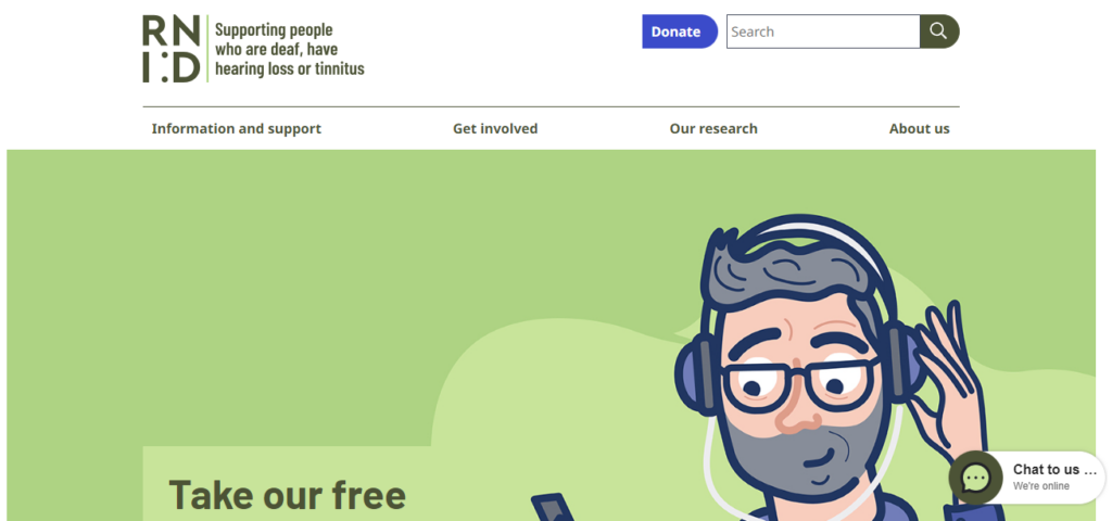
RNID, a hearing loss charity, is the perfect example of a website that understands the intricacies of text-scaling functionality.
A visitor is able to scale any text by up to 300 percent without the words falling off the page. And true to their commitment to supporting those with hearing loss, the site is simple and screen-reader-friendly.
10. Hilton Columbus
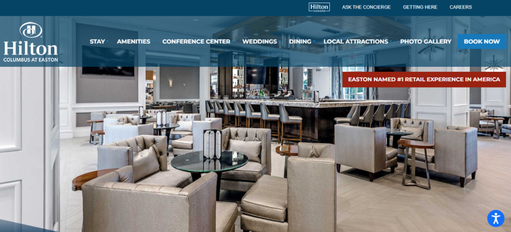
Hilton Columbus receives bookings from foreigners and locals throughout the year, making accessible design a top priority for this brand.
This is another site that uses the accessiBe accessibility tool to ensure visitors can alter their browsing and booking experience to meet their needs.
One interesting feature of the accessiBe panel is the seizure safe profile. This option makes it possible for anyone who suffers from seizures to immediately disable any flashing or blinking elements as well as risky color combinations.
11. Partake Foods
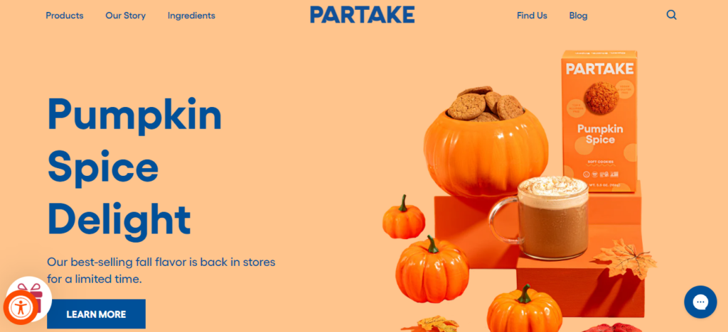
Another impressive accessible web design example is Partake Foods.
Each page has been created with accessibility and the user experience in mind. Visitors can explore Partake’s offerings using a mouse or keyboard and adjust text size, pause animations, and change the fonts to a more readable format.
You will also see that the text on each page is well structured and the appropriate header tags have been used to create a smoother experience for those who rely on assistive technology.
12. National Federation of the Blind
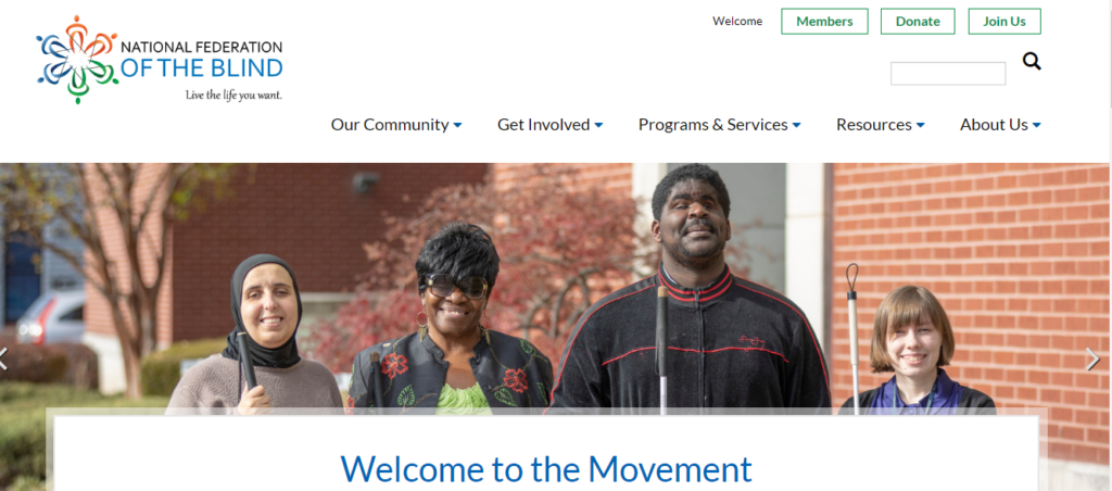
As an organization that supports the blind community, it’s only natural for website accessibility design to be a core focus.
From simple navigation and clear header tags to short, relevant, and descriptive alternative text, this is a prime example of what an accessible site should look like.
13. Girls Who Code
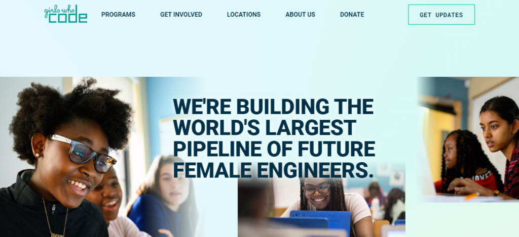
This inspiring brand is no stranger to inclusivity and its site is another perfect example of how a website can look good and be accessible.
What really stands out on this site is the simple and structured coding. Not only is this great for SEO purposes, but the clean HTML ensures that visitors using assistive technology can easily navigate and understand the site.
Accessible Website Solutions
If you want to take the next step and ensure your website complies with the latest WCAG requirements, two solutions are highly recommended.
- WCAG
- ADA
- AODA
- Section 508
- Account managers available to guide you
- 5 min installation
- 100,000+ clients use accessiBe
- Includes accessibility statement and certification
- Built specifically for websites and small and medium-sized businesses (SMBs)- some web apps might not be compatible
- WCAG
- ADA
- AODA
- Section 508
UserWay is trusted by thousands of leading brands that want to create a more inclusive experience for their online users. With the help of an easy-to-use accessibility overlay, it’s never been easier to ensure your Magento site is compliant with some of the top ADA requirements.
- Quick and easy process
- Multiple solutions and services offered
- 1M+ website installations
- Special monitoring tools for developers
- Customer support is lacking
To Wrap Up!
As you can see from these top accessible websites, there’s no need to choose between accessibility and creating a beautiful website – there is room for both.
By implementing some basic accessibility principles, it’s possible to provide an engaging experience on your site while still complying with disability acts such as the ADA, AODA, and Section 508.
Plus, there are a number of excellent tools available to help you along the way.
How we reviewed this article
0 comments
0 Comments