Color Blind Accessibility: Web Design for Color Blindness


Color is an integral part of web design. Without typing a word, color can be used to convey messages and meaning.
And while most website users can easily pick up on these queues, millions of people (1) struggle due to visual impairments such as color blindness.
In this article, we will unpack how color blindness is linked to accessible web design and the steps you can take to ensure anyone can easily engage with your site.
Color Blind Accessibility Explained
Someone who is color blind can still see pigmentation but will have trouble distinguishing between colors.
Red-green color blindness is the most common and makes it difficult for a person to distinguish between red and green. Green can often look red and red can look like a dull green.
Blue-yellow color blindness is less common and as the name suggests, causes someone to confuse blue and yellow with other colors.
And, in rare cases, a person could have monochromacy, which means they cannot see any colors at all.
Color blind accessibility means designing a website, app, and/or documents with these users in mind. With the right colors, contrasts, and patterns, color blind users will be able to read and interact with your brand online.
Why Web Design for Color Blindness Matters
The most common form of color blindness affects 1 in 12 men and 1 in 200 women.
This means a sizable percentage of people who visit your website may be color-blind, making it essential for you to familiarize yourself with color-blind accessibility guidelines.
Users who land on your site and cannot read the content are very likely to leave, which means you lose out on potential business and may even experience a drop in customer loyalty. The more website visitors feel included and cared for, the more often they will return.
What’s more, a number of global disability acts such as the ADA now have strict web accessibility guidelines. Failing to comply can result in costly fines, lawsuits, and reputational damage.
WCAG and Color Blind Accessibility
The Web Content Accessibility Guidelines (WCAG) form the basis of most of today’s web accessibility laws.
Adhering to the guidelines outlined in WCAG is the quickest and easiest way to comply with legal requirements and cater to color-blind visitors.
There are three different levels of WCAG compliance that you can achieve: A, AA, and AA, with AA being the level that most websites should focus on.
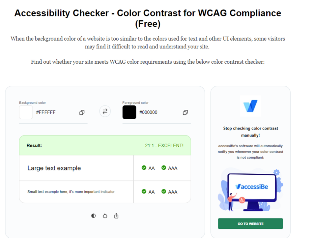
WCAG level AA requires a color contrast ratio of at least 4:5:1 for normal text and 3:1 for larger text. A ratio of 3:1 also applies to graphics and user interface components. Large text is seen as 14 point and larger, or bold. There are no color contrast requirements for logos and brand names.
Color Blind Website Examples
Before we get into the specifics of designing for color blindness, let’s look at some examples of websites that get it right.
Trello
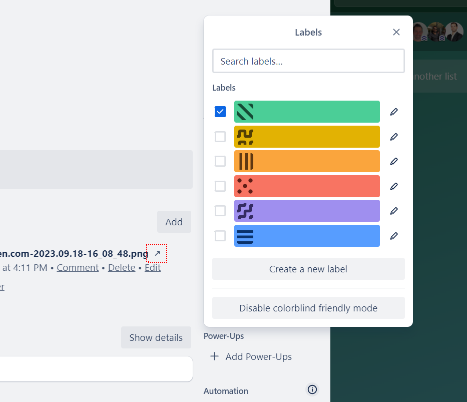
Trello is a leading project management and organization tool. It’s simple and fun to use, but it also caters to users with color blindness.
In 2014, the platform introduced a Colorblind Friendly mode that adds a textured overlay to colored labels. These textures make it easier for color-blind users to distinguish between different colored labels, ensuring they can still use Trello for its intended purpose.
The Florida Bar
Dark mode is a feature that’s available on many of today’s color-blind websites and The Florida Bar site is one of them.
Using this mode makes it possible to adjust colors and reduce eye strain by toning down any colors that might make it difficult to engage with a website.
Glasses USA

Another brand that keeps color-blind accessibility in mind is Glasses USA.
By installing an accessibility panel on their site, visitors have the option to adjust colors as well as the contrast of those colors to improve their browsing and shopping experience.
Dexcel

Visitors with color blindness have the ability to adjust the colors on the Dexcel website using the accessiBe accessibility panel.
The panel includes different color combination options that will change the text and menu items on a page, ensuring they’re easier to read and see.
Oksana Masters

With Oksana Masters being a professional sportswoman and Paralympic sports medalist, it’s not surprising that her website is accessible.
All of the graphics and text are minimalistic, making the site easy to navigate and engage with, even if you are color-blind.
How to Test for Accessibility for Color Blindness
It’s not always possible to tell whether a website meets the necessary color accessibility requirements just by looking at it.
Fortunately, there are a number of tools available that can help you test your site against WCAG’s recommended color contrast ratios.
If you want to get started for free, you can use the below Color Contrast Checker tool from AccessibilityChecker.
How to Design for Color Blindness
Now that you know whether your site meets the required color contrast ratios, let’s get into some web design best practices that cater to color-blind visitors.
Even if your site’s color contrast ratios are correct, you should still consider the below tips related to accessibility for color blindness.
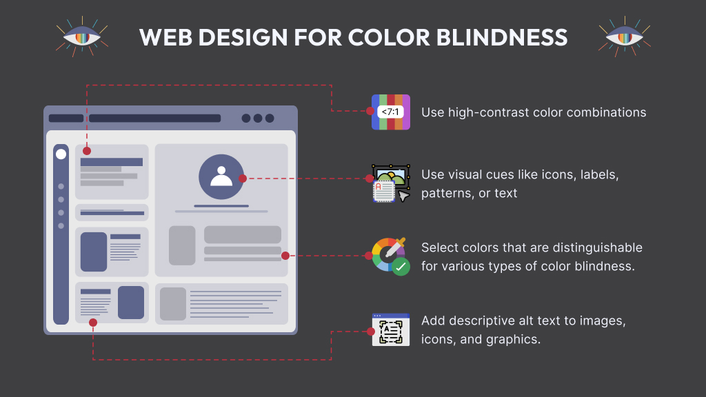
Be Wary of Certain Color Combinations
There are certain color combinations that are particularly difficult for color-blind users to process, so it’s best to avoid them. The main color combinations that should be avoided are:
- Green & Black
- Blue & Gray
- Green & Blue
- Green & Brown
- Green & Gray
- Blue & Purple
- Light Green & Yellow
- Green & Red
Don’t Rely on Colors Alone
While color is a useful way to convey meaning and messages, you shouldn’t rely on color alone. Using colors in conjunction with symbols will ensure that even color-blind users are able to understand when their attention is required.
Incorporate Patterns and Textures
As shown in the example of Trello’s website, patterns, and textures can be used to help color-blind visitors better distinguish between colors, buttons, graphics, and other functions on a site. Textures and patterns such as dots, checkers, and lines can all be used to improve the user experience.
Use Labels
For any on-site elements where colors and textures won’t work, find a way to incorporate labels. One example of this is an eCommerce site that sells products in different colors. By using labels, all visitors can clearly understand the different options. Labels are also screen-reader friendly, which means users with other visual impairments benefit too.
Monochrome Minimalism
By using multiple shades of a few colors instead of too many different colors, you can create a more color-blind-friendly website. A good way to test that these shades aren’t too similar is to view a site in grayscale mode. If your site has an accessibility solution such as accessiBe or UserWay installed, you can test your site using the monochrome setting. This will show you how a color-blind user experiences your site.
Opt for Thicker Lines
The severity of color blindness can vary. Some people can see a color if there’s a lot of it, which is why it helps to use thicker lines and fills where possible. Pairing the color with texture also helps. This tip is particularly relevant to elements such as maps, graphs, and infographics.
Make Links Easy to Identify
The links on your website should always be easy to spot. Along with making links a different color, it’s best to underline them. This way, a user knows a menu item or anchor text is clickable. Icons can also be incorporated to simplify navigation even further.
Conclusion
When you start considering accessibility and color blindness, UX design takes on a whole new shape.
But, by keeping key web accessibility guidelines in mind right from the start, it’s much easier to create a site that’s inclusive and offers a memorable experience for all users. Plus, there are countless tools available to help you along the way.
FAQs
What colors should I avoid for accessibility?
There are several color combinations that you should avoid when designing a website with color-blind users in mind, including green & black, blue & gray, green & blue, green & brown, green & gray, blue & purple, light green & yellow, and green & red.
Is red a bad color for accessibility?
With red-green color blindness being the most common, red is a color that should be avoided where possible, especially in conjunction with green. For people with this type of color blindness, red can look green or black. When used with white, red and white will appear black and white.
Is color blindness seen as a disability in the ADA?
Since color blindness can limit life activities such as seeing, learning, and working, it is considered a disability under the Americans with Disabilities Act (ADA). However, a disability needs to substantially limit life activities for it to be viewed as one so there is a slight gray area when it comes to color blindness and accessibility.