Color and contrast may be simple elements when it comes to web design, but it means so much more to online users with low vision and color blindness.
Color and contrast are integral parts of the Web Content Accessibility Guidelines (WCAG) and need to be considered when testing and remediating your website.

Color contrast refers to the difference in brightness between background and foreground colors.
For people with low vision or color blindness, distinguishing the difference between certain colors can be difficult, if not impossible. Even more so if they encounter a website with poor color contrast.
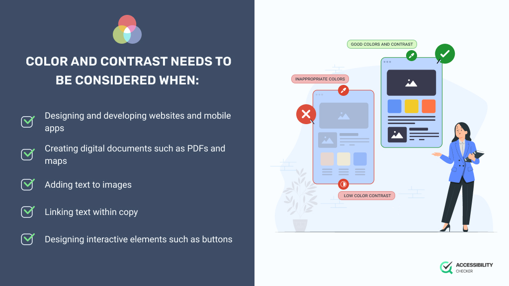
Color and contrast needs to be considered when:
Even the size and weight of your font can impact color contrast, which is why it’s such an important WCAG guideline.
The only elements that color contrast guidelines don’t apply to are logos, interface components, and decorative elements.
Here are the success criteria you would need to meet for color and contrast in order to achieve Level A or higher.
Color should not be used as the only means to convey information, indicate an action, prompt a response, or distinguish a visual element. An alternative should be provided to cater to users who cannot perceive color but would still benefit from this information.
Any visual presentations of text or images of text should have a color contrast ratio of at least 4:5:1. For any large-scale text or images, a color contrast ratio of 3:1 would apply. As previously mentioned, any decorative elements, user interface components, or text that is part of a logo doesn’t have any color contrast requirements.
These are the minimum color contrast requirements for achieving level AA, which is the recommended level of compliance.
For website owners who want to achieve level AAA, which is almost never necessary, there are enhanced color contrast requirements.
The visual presentation of text or images of text should have a color contrast ratio of at least 7:1. However, this won’t apply to large-scale text, which should have a ratio of at least 4:5:1.
A color contrast ratio of at least 3:1 against adjacent colors will apply to any visual information that’s needed to identify user interface components and states. This doesn’t apply to inactive components. This ratio will also apply to any graphical objects that are essential to the information being conveyed.
To achieve Level AA by complying with the necessary color contrast requirements of WCAG, here are some best practices you can follow:
Use a color contrast checker. To better understand whether your website meets the necessary color contrast requirements, use a tool such as AccessibilityChecker’s Color Contrast Checker.
Avoid problematic combinations. There are certain color combinations that are far more problematic than others. Green and red and blue and yellow are two color combinations that should be completely avoided if possible.
Use white and dark space. For pages with low-contrast colors, it helps it separate sections with white or dark spaces.
Don’t use color for emphasis. Instead of using color to emphasize a word or sentence, rather bold it.
Distinguish elements with icons, patterns, and underlines. To avoid using color as the only indicator, consider incorporating icons, patterns, and underlines instead. This can be particularly useful for interactive elements and error status messages.
Create a high contrast between text and backgrounds. If you’re using a darker background your text should be lighter and vice versa.
Avoid photographic or gradient backgrounds. These types of backgrounds can make text difficult to read. Use solid backgrounds wherever possible.
Simple fonts are better. When it comes to your text, larger text and simple fonts are always preferred as this will aid in your color contrast efforts.
Level AA is the middle level of WCAG compliance – it’s what most businesses should aim to achieve. Level AA is associated with a color contrast ratio of 4:5:1 for normal text and 3:1 for larger text. These ratios work with most assistive technologies. Level AAA is a more advanced level of compliance that requires a color contrast ratio of 7:1 for normal text and 4:5:1 for larger text.
Most of today’s global disability acts that mention web accessibility incorporate WCAG standards. Businesses that fail to meet these requirements are failing to comply with accessibility laws, which could result in a lawsuit.
WCAG colors are combinations that are accessible to all online users, including those with disabilities. WCAG colors specifically apply to people with low vision or color blindness and comply with the necessary minimum color contrast ratios of 4:5:1 and 3:1.